S, M, L, XL: The Question of Scale in Screen Media
by: Alex Munt / Macquarie University
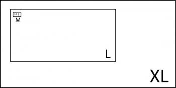
The proliferation of screen media has been so swift that many questions remain unanswered. In convergence culture [S]mall, [M]edium, [L]arge and [EX]tra-[L]arge screens all compete for ‘eyeball attention’. The contemporary screenscape is fragmented due to rapid advances in digital compression formats and distribution platforms. What to watch? When to watch it? On which screen? For me, these questions instil a certain level of screen-anxiety.
Focus is often toward the technical ‘quality’ of competing media, such as the mp3 debate in the digital distribution of music. But screen media is a visual medium. And one significant issue, often glossed over, is that of screen size, or scale. The lack of attention paid to the aesthetics of scale sits at odds with its place in the history of the visual arts. Scale remains relevant to the other art forms – the fine arts, architecture and urbanism. Does size matter for screen media?

[S]mall
Mobile/Computer Screens Chuck Tyron wrote an interesting Flow column looking at ways in which “the computer appears to be supplanting both the movie screen and the television set”. Tyron points to the first (legally) self-distributed feature film on YouTube: Four-Eyed Monsters. This feature was initially released as a series of 8 video podcast episodes (for computer, PSP or I-Pod consumption). Next, the entire work was uploaded to You Tube in the form of a 71 minute ‘Clip’. The creators of Four-Eyed Monsters (Arin Crumley and Susan Buice) position themselves as Independent filmmakers. The feature has also screened at film festivals and some theatres, through self-distribution. It is available for DVD purchase.
Four-Eyed Monsters
For me, the Four-Eyed Monsters experience unfolds on my laptop screen, in a You Tube screen which measures 11cm x 8cm. I don’t make it through the 71 minutes. My fear is that, with the miniaturisation of new screens, we have discarded a century-plus of film culture which has debated the aesthetic impact of film language, scale and aesthetics: mise-en-scène, camera movement, shot size and duration. Can a feature really shift so effortlessly across scenes? Lev Manovich tells us that a key principle of the New Media is that it can exist “in different, potentially infinite versions” (2001: 36). But surely these multiple versions need to address the notion of scale, if they are to be consumed across the contemporary screenscape?
[M]edium
Widescreen TV The DVD of Bubble (2005), from eclectic and prolific filmmaker Steven Soderburgh, carries the tagline: ‘another Steven Soderburgh Experience’. On January 27, 2006 the feature was simultaneously released in movie theatres and satellite/cable TV (HD Net Movies) with a DVD release on January 31st (Wikipedia). Bubble created controversy by mounting a challenge to the traditional ‘release window’ formula. Some theatres chose to boycott the film as a stance against the ‘cannibalisation’ of their product. In Wired , Soderburgh predicts “it will be a while before bigger movies go out in all formats; in five years, everything will.”

I purchased Bubble from Amazon and watched it on my 40-inch Sony Bravia (HD) LCD television screen. The film was shot with the expensive HD cameras which Lucas used for Revenge of the Sith. For Bubble, Soderburgh opts for a entirely different digital aesthetic than the gaudy VFX of the Star Wars prequels. He speaks about a ‘digital stillness’ in digital cinematography (no film runs through the camera) and opts for static, tableaux shots, wide-angle lenses and significant colour grading (in post). With the HD format (1920×1080 pixels) there is an ‘easy’ equivalence between the camera and the HD widescreen television. But Bubble works against this, by eschewing the 16:9 ratio for a more ‘cinematic’ theatrical ratio. The film looks and sounds great on the Bravia.
For Soderburgh, the cinema remains “the number one destination” (Wired) His ‘design’ for Bubble provides a feature film which will work across screen scale at the Medium/Large end. Soderburgh also provides a refreshing take on the idea of multiple versions of feature films across screen platforms. He advocates a mix/mash-up aesthetic:
“I’d like to do multiple versions of the same film. I often do very radical cuts of my own films just to experiment, shake things up, and see if anything comes of it. I think it would be really interesting to have a movie out in release and then, just a few weeks later say, “Here’s version 2.0, recut, rescored.” The other version is still out there – people can see either or both. For instance, right now I know I could do two very different versions of The Good German. (Wired)
[L]arge
Theatrical 2D The battle of the screens in the1950s is well documented. A series of widescreen formats, such as Cinerama (2.8:1), were engineered by the studios in a climate of panic. Today, the fear is back. In Australia, Village Cinemas use the catchphrase: ‘See it Bigger, See it Better, See it First: Only at the Movies’. This is a footnote to movie poster advertising for new theatrical releases. It runs on television, newspapers and is planted on buses and billboards around the city.
In order to keep their promise to the theatre chains, Hollywood (arguably ‘Post-Classical’ Hollywood) is also fighting back. Recent Blockbuster cinema reveals an amplification of classical Hollywood narration: in terms of duration (features are getting longer and longer) and in terms of scale. The latest Bond film Casino Royale (2006) provides a good example. An early scene involves a foot chase through a building site in Madagascar. It lasts almost 10 minutes. The scene is a live-action sequence performed by Sébastien Foucan, founder of ‘free-running’. It displays a hyperkinetic aesthetic, marked by rapid cutting and fluid, mobile cinematography. I saw Royale on the cinema screen and (for this part of the film) was convinced by the ‘Bigger…Better’ mantra.
Casino Royale
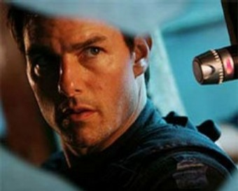
Mission Impossible III (2006) (the best one by far) also presents an interesting case. Writer/director J.J. Abrams was head-hunted by Tom Cruise after seeing Alias on DVD. With his strong background in television production, Abrams brought a new aesthetic to the Mission franchise. The film starts in Close Up (CU). Abrams cuts between handheld CUs of the protagonist Ethan Hunt (Tom Cruise) and the villain Owen Davian (Philip Seymour Hoffman). This presents a ‘mutation’ of the television aesthetic on the big screen. It makes for a thrilling start, helped by the riveting performance by Seymour Hoffman.

eXtra Large
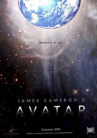
Theatrical 3D Avatar (2009) is the forthcoming Blockbuster from James Cameron, his first feature since Titanic (1997). The claim is that Avatar “will test new technologies on a scale unseen before in Hollywood”; Cameron describes the project as “a true hybrid – a full live-action shoot, with C.G. characters in C.G. and live environments.”
(See Entourage for a parody of Avatar as ‘Aquaman’: James Cameron plays himself in an amusing cameo).

Cameron’s ambition is to create a ‘next-generation’ experience which will stand alongside 2001: A Space Odyssey (1968) and Star Wars (1977). The cinematic scale of Avatar is reflected by its budget of around $200 million (USD). This makes the studios nervous, who are already hyping the film. Jim Gianopulos (co-chairman of Fox) says:
‘This will launch an entire new way of seeing and exhibiting movies…once again Jim is transforming the medium. Jim’s not just a filmmaker; every one of his films have pushed the envelope, in its aesthetic and in technology…”
Big claims for a big film. But given the shaky history of 3D in the cinema, I would be nervous too.
Coda
The notion of scale in contemporary screen media is significant in a culture of convergence and excess. Heterogeneity of platforms and formats exists: from micro-screens of mobile media to new 3D digital theatrical projection. But beyond the hype, the formal and aesthetic implications of scale should be addressed. This is not to prioritise any historical or conservative notion of scale but rather to promote those creative, messy juxtapositions in screen culture: towards an adaptation, amplification, collision and mutation of screens.
The title to this column was lifted from Rem Koolhaas’ wonderful ‘novel’ on architecture S, M, L, XL.
Works Cited
Jardin, X. (2006) ‘Thinking Outside the Box Office’, Wired , accessed 20 September, 2007
Manovich, L. (2001) The Language of New Media, Cambridge: The MIT Press
Thompson, A. (2007) ‘Cameron sets live-action, CG epic for 2009’, The Hollywood Reporter, accessed 20 September, 2007
Waxman, S. (2007) ‘‘Titanic’ Director Joins Fox on $200 Million Film’, The New York Times, accessed 20 September, 2007
Image Credits
1. Diagram of Comparative Screen Sizes
2. You Tube
4. You Tube
5. Ethan Hunt
6. Owen Davian
7. Avatar ‘Teaser’ Poster from FirstShowing.Net
Please feel free to comment.
Thanks for an interesting article Alex. The question of scale is in fact directly addressed by John Ellis in Visible Fictions through a comparison between conventional CRT television (Ellis was writing in the 1980s) and cinema, with the smaller screen of television contributing, according to Ellis, to a non-fetishistic aesthetics of the ‘glance’ (as opposed to a cinematic ‘gaze’) that augmented other features of televisual intimacy and domesticity (Caldwell famously challenged this ‘glance theory’, though not entirely succesfully I think). It might be worth thinking about current changes of screen scale historically through the dialectical relationship between technologies and rhetorics of minituraziation and giganticism. History is important here: the miniature tv was a feature of my childhood, and I’m now in my 40s(!), while the development of larger cinema and television screens is nothing new, notwithstanding the importation of cinematic viewing models into the home along with plasma and LCD screens. I also think that ‘scale’ cannot be entirely isolated from other related practices and features: Ellis was right, for instance, to relate television’s relatively small screen size to its domestic context, it’s ideology of liveness and the apparent intimacy of its direct modes of address. Whether the same can be said for the scale of youtube or video seen on cellphone screens is another matter. Definitely much to ponder here.
Paul. You’re right – scale needs to be considered within such theories/histories/contexts about the consumption of screen media. What I really wanted to push here – is the screen-practice approach to scale: how do screenwriters/ designers/ directors/ cinematographers etc. work across/against screen scale and what is the impacts on aesthetics of the moving image(s)?
I wonder about the connection between screen size and content. The demise of Sony’s UMD movie format for the PSP suggests that people aren’t interested in watching movies on a 4.3 inch screen, no matter what the image quality. And while I’m not well versed on the sales numbers, from anecdotal evidence it seems that sales of TV shows on iTunes surpasses movies. And then, conversely, there are the short runs of feature films on Imax screens and TV shows on movie screens (the Alamo Drafthouse in Austin has regular screenings of the more popular TV shows). Clearly there is something about the content of your garden variety YouTube video that makes it work on that screen size with attendant low visual quality (due more to a desire to save bandwidth than the screen size). In this regard, your take on the implications a feature such as “Four Eyed Monsters” on YouTube has for film aesthetics is particularly curious.
The idea that work migrates across multi-platforms is good and exciting. But this needs to happen not only at the level of consumption of the moving image – but also at the level of screenwriting and design for this scale. 4EM as a ‘feature film’ distributed by filmmakers on You Tube – suggests that the screenwriting and aesthetics/language of the cinema (scale particularly) is transportable across screen size, a point I disagree with. Much more interesting is to experiment, play, re-work a project into ‘versions’ (like Soderburgh’s idea) of screen works – I think this is where the interesting stuff lies. (Many write on the similarity between the scale of new media screen sizes and early cinema. Just as early cinema invented a language of its own [intertitles, narration, short-form] – the new platforms should consider this context and evolve/mutate an inherited language from contemporary cinema/TV etc. Whilst the You Tube window will grow (with bandwith) the windows of mobile media will remain.