Queuing at Lloyds Bank
Diane Negra / University College Dublin
[youtube]http://www.youtube.com/watch?v=U7ijWIZ9tzA&feature=related[/youtube]
On a busy Saturday morning last month I found myself queuing at my local branch of Lloyds Bank. Bank lobbies, like so many other places we frequent for commercial purposes, have become screened spaces, and my eye was drawn to the pleasant combination of blue, green and black on the screen positioned at the front of the queue (but away from the tellers serving customers). Blue, green and black are the colors associated with the bank’s logo, a rampant black horse against a blue/green background which is semiotically ubiquitous in the British high street. The screen was displaying an elaborated version of Lloyds ads I had already seen on television. These ads are distinctive for a number of reasons: they feature a lilting soprano soundtrack, small Weeble-like human figures negotiating stressful life events like moving house with aplomb, and a unifying image of an ideal public transport system that seems to meet everyone’s needs just fine (this last is a particularly powerful premise in contemporary Britain).
I should add that while I register the ad’s music (which is called “Eliza’s Aria”) as pleasant, and its images as seductive, a number of others would seem to disagree. YouTube users variously describe the ads in the campaign as “bloody creepy,” and “the scaryest frickin’ thing ever.” Although one writes that “this song makes me happy,” another avers that “these adverts give me a weird feeling,” and someone else complains “everyone is whistling this tune. It’s driving me crazy.” Intriguingly, one poster observes that “this reminds me of the Victorian times. Don’t know why.”
Acknowledging the musical connection between the Lloyds soundtrack and the tranquilizing tune that soothes the townspeople as they take delivery of new pods in Invasion of the Body Snatchers, I want to briefly consider how a piece like this operates as an exercise in brand reinforcement, as an example of new 21st century forms of ambient tv/video, and even potentially as a deterrent to the bureaucratic anger that increasingly shapes contemporary life. How does this form of television resemble but also differ from the CNN screen on the gasoline pump or the Fox News broadcast beamed in beside Dick Cheney’s photo in the airport customs hall? How do its tone, style, coolness and color scheme assuage the kind of intense customer frustration 21st century commercial institutions are so effective in instilling?

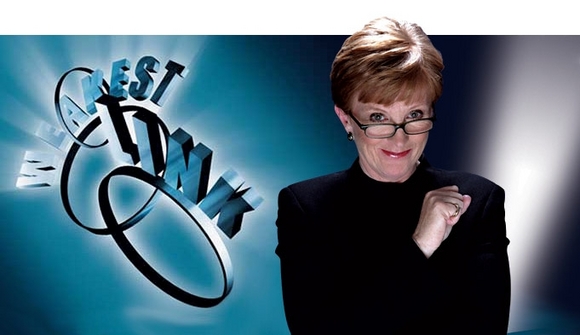
I use the term “bureaucratic anger” to refer to the sense of mingled powerlessness/rage that many consumers express in their encounters with large corporations. Kathleen Woodward has employed it in the context of analyzing “the emotional violence of everyday life in contemporary postindustrial society”1. The dynamics she alludes to are part of a state of affairs that in Britain has been referred to as a “social recession.” The shift to a daily environment increasingly marked by antagonistic worker/customer relations and competitive intra-institutional arrangements is one of the social recession’s most pronounced and pervasive developments. This shift goes unrecognized by and large but has been underwriting many of the most popular entertainment genres of the early 2000s, in particular reality television, where scenarios of competition for a date (The Bachelor), a job (The Apprentice), or simply survival in an artificial social bubble (Big Brother) or a brutal jungle (Survivor) have dominated the ratings in recent years. A key concept in many such series is the idea that one strategically participates as a team player only to the point at which self-interest invariably prevails. A number of them are also dependent on a hyper-authoritarian centralizing figure such as Anne Robinson in The Weakest Link or Donald Trump/Alan Sugar in The Apprentice. In both the US and the UK other kinds of reality television series such as “Airport” train our gaze on front-line staff thereby occluding any consideration of the management whose decisions lead directly to the stressful scenarios and conflict between passengers and staff profiled by the series.

Against this backdrop we have the Lloyds campaign which promises the viewer that Lloyd’s services are at our disposal “for the journey” (of life). Seemingly positioned to neutralize or at least minimize consumer impatience in a bank lobby, the video’s atmospherics are cool and soothing, its soundtrack syncopated and convivial. Most insistently, the ads produce an image of perfect synchronicity between individuals and broader social institutions (like banking and transport). The ads’ images of fluid coordination and total systemic integration convey the idea that things work and that our place in the larger order is supported, not threatened, by institutional forces. These ads sell us on the idea of the big, integrated system, illustrating that the choice of this material in the bank lobby is strategic on more than one level. Just as CNN’s focus on the economy and Fox’s shrill emphasis on homeland security are particularly rhetorically/ideologically apposite for the gas station and the customs hall, the placement of the Lloyds video screen is specifically tailored to the affective environmental conditions of the lobby, seeking to remind us of why we are there, to re-incentivize us in case we are restless and to reassure us of corporate goodwill. Thus, the placement of a video screen in the Lloyds lobby serves multiple and complex functions and offers a reminder of the value (as Anna McCarthy has shown) of remaining attentive to the particularities of non-domestic screen sites.2
In closing then I want to return to the suggestive comparison made by the YouTube poster between the ad and “Victorian times.” Bearing in mind the Lloyds campaign’s powerful vision of a world that is authoritarian, orderly, well integrated and calm and its screening placement at a site of potential bureaucratic anger, the poster’s intuitive comparison doesn’t seem to me at all fanciful or far-fetched.
Image Credits:
1. Lloyds Bank
2. Dick Cheney on Fox News
3. The Weakest Link Host Anne Robinson
4. Front Page Image
I think you point out an interesting avenue of research – “screened spaces,” as you call them. Although it’s an acute example, my bank has recently instituted a system whereby patrons line up at one of several tv screens, pick up a phone, and video conference with a teller in another room to conduct business. While gesturing towards a different point than you raise here, I wonder if both point to TV or similar screen images which, once consumed in private spaces, are now consumed differently through mobile TV devices and TVs installed in public spaces—and if this makes a difference in programing or aesthetics.
I’d be very interested in seeing how this works with other types of “screened spaces” — in particular, I’m thinking of the introduction of screens in the queue spaces at theme parks (and the Texas State Fair and similar events) here in the United States. I think these are definitely media spaces that are ripe for further exploration.
J’apprécie la façon dont vous abordez ce sujet. Je dois dire que je ne regrette en rien de m’être abonné à votre weblog. A bientôt.
référencer son site http://bloggooglepandaupdate.wordpress.com agence référencement