Touching Feeling Hands: Gender, Race, and Digital Devices
Michele White / Tulane University

Facebook depicts the platform’s white thumbs-up icon with a blue cuff as part of its “Content unavailable” message. However, the lifted and purportedly agile thumb is wrapped in a pink bandage. Wrapping a bandage around the thumb suggests that the appendage and its references to Facebook matter, including having a materiality. Facebook’s ordinary thumbs-up “like” icon and button support its claims about the embodied aspects of people’s engagements, and the platform’s influence on touching, feeling, and empowered participation. The icon acknowledges others and suggests that everything is fine even as it asserts able-bodied physiognomies.
Facebook’s bandaged thumb playfully, but also impactfully, uses the injured finger to note that the file has not been found. Given the connections among arm and hand pain and computer use, it is notable that Facebook suggests injury is associated with not viewing and not inputting further texts. The platform proposes that pain, injury, and a sense of loss occur when the connection between the physical aspects of the individual and the platform are “broken” according to an associated error message with a snapped link. In a related narrative about trying to recover a Facebook post and finding a version of the bandaged thumb, Hunchly notes that the “thumbs up with the bandage didn’t make me feel very good.”[1] Thus, Facebook’s representation and warning about pain and lack of access generate and acknowledge the sentiments that accompany digital viewing.

Facebook added “reactions” to the thumbs-up “like” button in 2016 as a means of trying to amplify the feelings associated with the platform and people’s engagements. Product designer Geoff Teehan indicates that the company wanted to “make the Like button more expressive.”[2] While managing the application, Fidji Simo suggested that Facebook launched reactions because people sought to “express how they felt.”[3] Yet, Facebook’s message that content is not available associates the thumbs-up icon and button with emotions. Facebook’s narrative about pain may also displace some of the implications of thumbs-up icons and buttons.
The “rule of thumb” and measurement of rods smaller than this metric determined tools for abusing women starting in the seventeenth century (and possibly earlier).[4] When spectators displayed their thumbs in the Roman Coliseum, they were identified as supporting the killing of gladiators who had lost matches. People employ YouTube’s and some other platforms’ thumbs-down “dislike” buttons to elide critical content and to dismiss participants. The designers of the Facebook icon and button, as well as most other interface hand-pointers, avoid cultural conceptions of femininity by not including fingernails in their depictions. It is the non-functional hand that is sometimes sheathed in a pink bandage. Facebook’s reference to white hands in shirt cuffs, blue borders, and earlier depictions of a male face associate the site with men and masculinity and script participants as white-collar and white men (and presumably connect them to Mark Zuckerberg).
In this essay, I continue my considerations from Touch Screen Theory: Digital Devices and Feelings and other research on how technology companies, device designers, and individuals correlate physically touching and emotionally feeling as methods of displacing the constructed aspects of devices and settings.[5] Queer theorist Eve Kosofsky Sedgwick argues that a “particular intimacy seems to subsist between textures and emotions,” an interconnection that is conveyed by the dual meanings of the terms “touching” and “feeling.”[6] For instance, Etsy employs representations of hands on the “About” part of the site to assert that its platform “connects” sellers “with millions of buyers looking for an alternative—something special with a human touch.”[7] These emotional connections are linked to material objects and contact by a series of illustrations of hands making things and hands cupping a purchased item that is “hand” delivered to the consumer. Individuals are encouraged to mesh with hand-held and screen-based technologies and to associate represented hands with their bodies and experiences of touching things.

The linking of digital devices, processing, platforms, and finger digits are supported by people’s employment of the terms “digit” and “digital.” The thumbs-up hand and hand-pointer magnify these connections because they are digital representations, elements that activate computer processes, and presumed reflections of individuals’ finger digits. The hand-pointer is thought to represent individuals’ hands, but it establishes whiteness and able-bodiedness as the norm. The hand-pointer references touching when direct contact with the screen is not a programmed or preferred action. It represents the agile individual’s hand “inside” and “outside” the screen and the hand of the individual connected to the hand of the device.
Hand-pointers are probably the most common computer representation of users. They structure and insist upon who individuals are, how they connect, and what their relationship is to screens and other digital devices. Given the correlation of the hand with the human, they offer a method of asserting (and ordinarily overstating) the ways people can control the computer and interface. In my research, I have critiqued the hand-pointer because of the ways it is designed to assert that the white material body is present. Since they are white, hand-pointers link aspects of digital media to a white positionality and race aspects of computers, interfaces, and online sites.
Representations of finger clicking and manipulating hands often appear in instructional manuals for computers. For instance, Microsoft presents a series of white grasping and pointing hands in its development documentation for “Windows Desktop Apps.”[8] Apple Developer’s Human Interface Guidelines represent the “Closed” and “Open hand” as white with a black outline.[9] Lines across the back of the hand reference the stitching on gloves, the strokes on gloves that cartoon characters wear, and the tendons beneath flesh. Apple also employs outlines of hands where the background and the surface of the hand are white to explain “Trackpad gestures for Magic Trackpad, Magic Trackpad 2, Magic Keyboard for iPad, and Magic Keyboard Folio.”[10] These representations of hands are associated with the icons that Susan Kare developed in the 1980s for the Macintosh computer.[11]
The linking of hand-pointers and hand icons to gloves (and Mickey Mouse) intensifies the associated racial scripts.[12] As media studies scholar Nicholas Sammond observes, cartoon characters and their “white gloves, wide mouths and eyes, and tricksterish behaviors” are associated with minstrelsy. Blackface minstrels employed gloves and other classed goods as means of parodying and denigrating the aspirations of black people.[13] Since Apple, Microsoft, and other companies use these operating system and interface representations of hands to connect the hand-pointer to the material body, a script about the body of the individual is intermeshed with and encoded into devices.
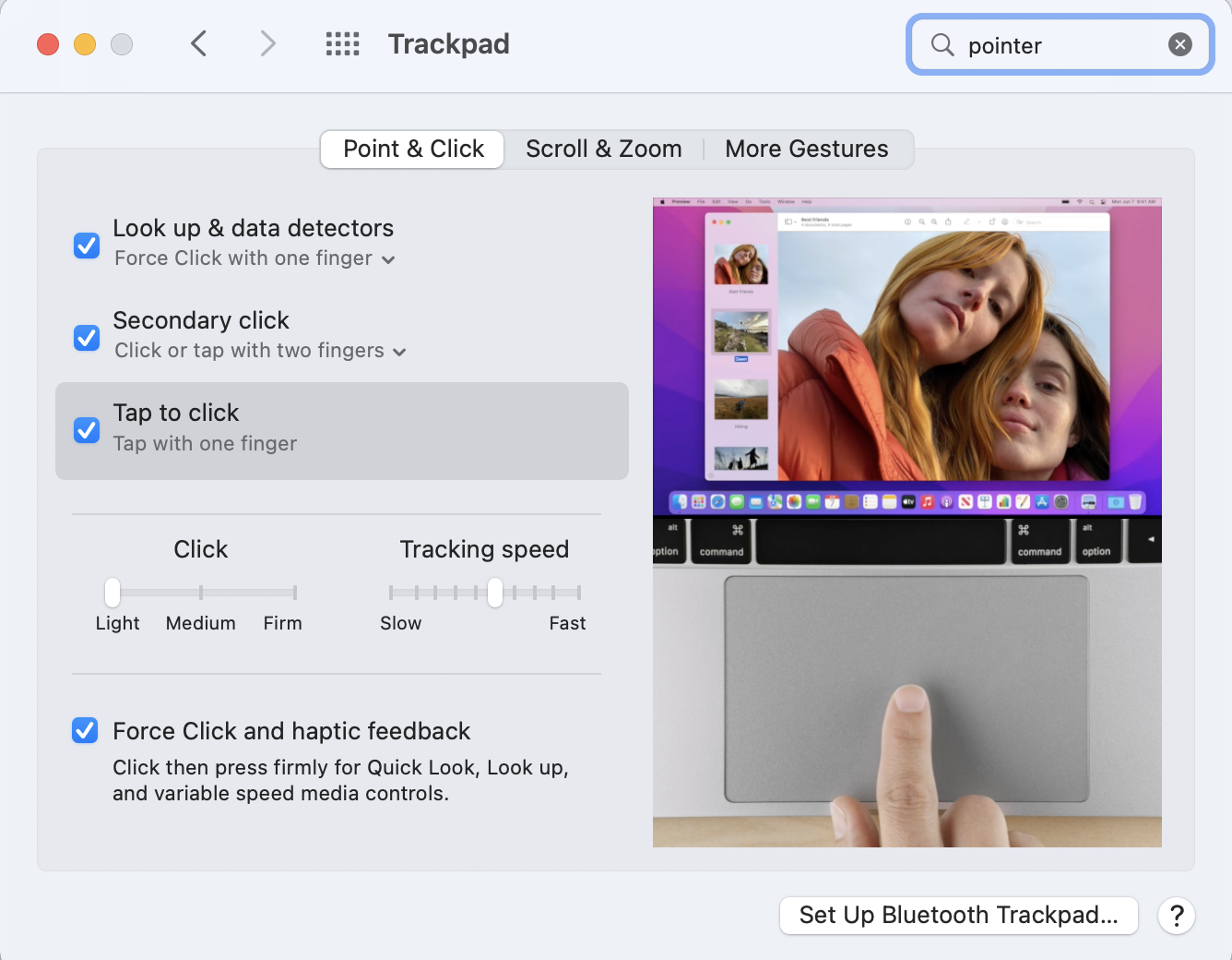
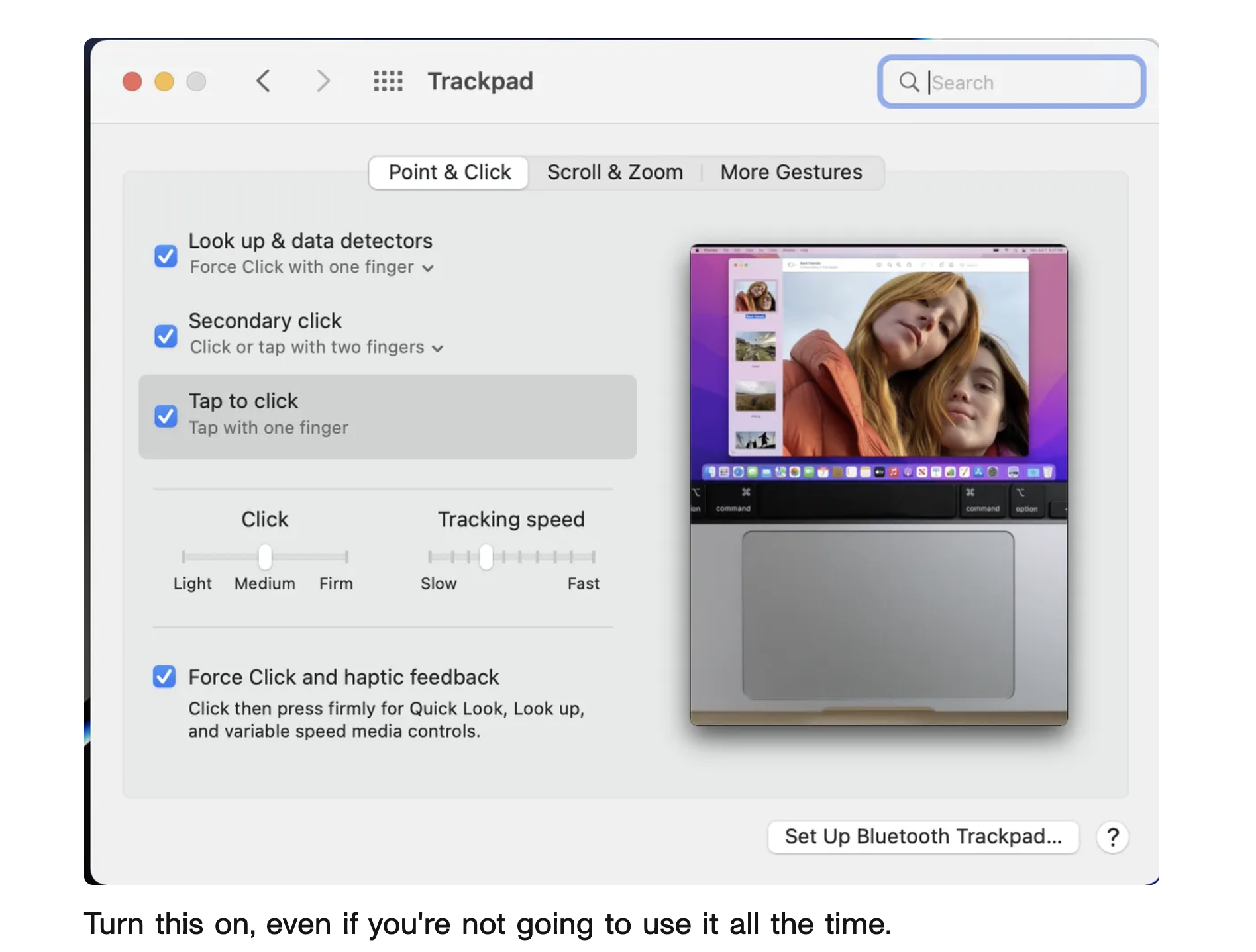
Gender and racial identities are also conveyed by Apple’s System Preferences settings for the trackpad and a series of videos that illustrate “Point & Click” and related options. In each of these representations, a light-skinned hand with short nails engages with the trackpad and produces actions on the split screen. At one point, this controlling hand accesses a cropped image of two light-skinned women. Aspects of the image, such as the women’s welcoming smiles and windswept hair and the focus on the touchpad, make the women appear to be visually and tactilely available and manipulable. I identify this stereotyped rendering of women as soft and available to the touch as constituting them as “to-be-touched-ness,” in an adaptation of Laura Mulvey’s analysis of the ways women are rendered as “to-be-looked-at-ness.”[14] This is enacted in Dan Ackerman’s article about the trackpad, which includes a screenshot of the empty touchpad and the two women. Ackerman’s suggestion that readers enable “tap to click” seems to be about these women. The image of them and the touchpad is titled, “Turn this on, even if you’re not going to use it all the time.”[15] In such contexts, the narrative about turning it/them on and the terms “tap,” which can mean to have sex, and “click,” which evokes connections, render women as waiting objects who are available and touchable.


These images and narratives conjure up the earlier use of the “finger” command to view an individual’s plan file and to get information about them. The erotic connotations of the finger command and the sexual “jokes” embedded in computer systems are underscored by the repeated explanation to “finger Lisa and see if she’s idle.”[16] People also rebuffed the finger command, and amplified the associated corporeal actions, by including ASCII representations of middle fingers in their plan files that individuals would view.
Companies’ and designers’ emphasis on white hand-pointers and thumbs-up hands should raise questions about methods for facilitating more diverse representations and engagements. However, Apple’s listing of the option to change the color of the hand under “Accessibility” displaces the racial aspects of interfaces, including the rendering of the accessibility icon as a white figure with hands and legs outspread. The linking of the hand to differently abled people should encourage considerations of designs that would present other hand configurations and alternative forms of moving, grasping, and identification.
Image Credits:
- Figure 1. Facebook, “Content unavailable.” (author’s screenshot)
- Figure 2. Hunchly, “Why I created Hunchly,” Medium. (author’s screenshot)
- Figure 3. Etsy, “About Etsy.” (author’s screenshot)
- Figure 4. Apple System Preferences, “Trackpad.” (author’s screenshot)
- Figure 5. Dan Ackerman, “Got a new MacBook?” CNET. (author’s screenshot)
- Hunchly, “Why I Created Hunchly,” Medium, 11 April 2016, 29 October 2022, https://medium.com/@hunchly/why-i-created-hunchly-513a3f870a8f [↩]
- Geoff Teehan, “Reactions: Not everything in life is Likable,” Medium, 24 February 2016, 25 November 2022, https://medium.com/facebook-design/reactions-not-everything-in-life-is-likable-5c403de72a3f [↩]
- Fidji Simo, as cited in Evelyn Lau, “Facebook Launches New ‘Hug’ Reaction Button in Response to Coronavirus,” The National, 17 April 2020, 25 November 2022, https://www.thenational.ae/lifestyle/facebook-launches-new-hug-reaction-button-in-response-to-coronavirus-1.1007243 [↩]
- Tom Tyler, “The Rule of Thumb,” JAC 30, nos. 3–4 (2010): 435–56. [↩]
- Michele White, Touch Screen Theory: Digital Devices and Feelings (Cambridge: MIT Press, 2022). [↩]
- Eve Kosofsky Sedgwick, Touching Feeling: Affect, Pedagogy, Performativity (Durham: Duke University Press, 2003), 17. [↩]
- Etsy, “About Etsy,” 23 October 2022, https://www.etsy.com/about?ref=ftr [↩]
- Windows App Development, “Mouse and Pointers,” Microsoft Learn, 7 February 2022, 25 November 2022, https://docs.microsoft.com/en-us/windows/desktop/uxguide/inter-mouse [↩]
- Apple Developer, “Pointing devices,” Human Interface Guidelines, 25 November 2022, https://developer.apple.com/design/human-interface-guidelines/inputs/pointing-devices/ [↩]
- Apple, “Trackpad Gestures for iPad,” Apple Support, 25 November 2022,
https://support.apple.com/en-ph/guide/ipad/ipad66ce6358/ipados [↩] - Susan Kare, “Apple,” 25 November 2022, http://kare.com/apple-icons [↩]
- Kit Grose, “Who created the Mac Mickey pointer cursor?” User Experience Stack Exchange, 15 September 2016, 25 November 2022, https://ux.stackexchange.com/questions/52503/who-created-the-mac-mickey-pointer-cursor [↩]
- Nicholas Sammond, Birth of an Industry: Blackface Minstrelsy and the Rise of American Animation (Durham: Duke University Press, 2015), 2–3. [↩]
- Laura Mulvey, Visual and Other Pleasures (Bloomington: Indiana University Press, 1989). [↩]
- Dan Ackerman, “Got a new MacBook? You Need to Change This Setting ASAP,” CNET, 22 September 2022, 8 November 2022, https://www.cnet.com/tech/computing/your-macbook-trackpad-has-an-annoying-setting-you-need-to-change/ [↩]
- Eric S. Raymond, “finger,” The Jargon File, version 4.4.8, 22 November 2022, http://www.catb.org/jargon/html/F/finger.html [↩]