Playful Metros and the Aestheticization of Disrepair
Juan Llamas-Rodriguez / University of Texas at Dallas
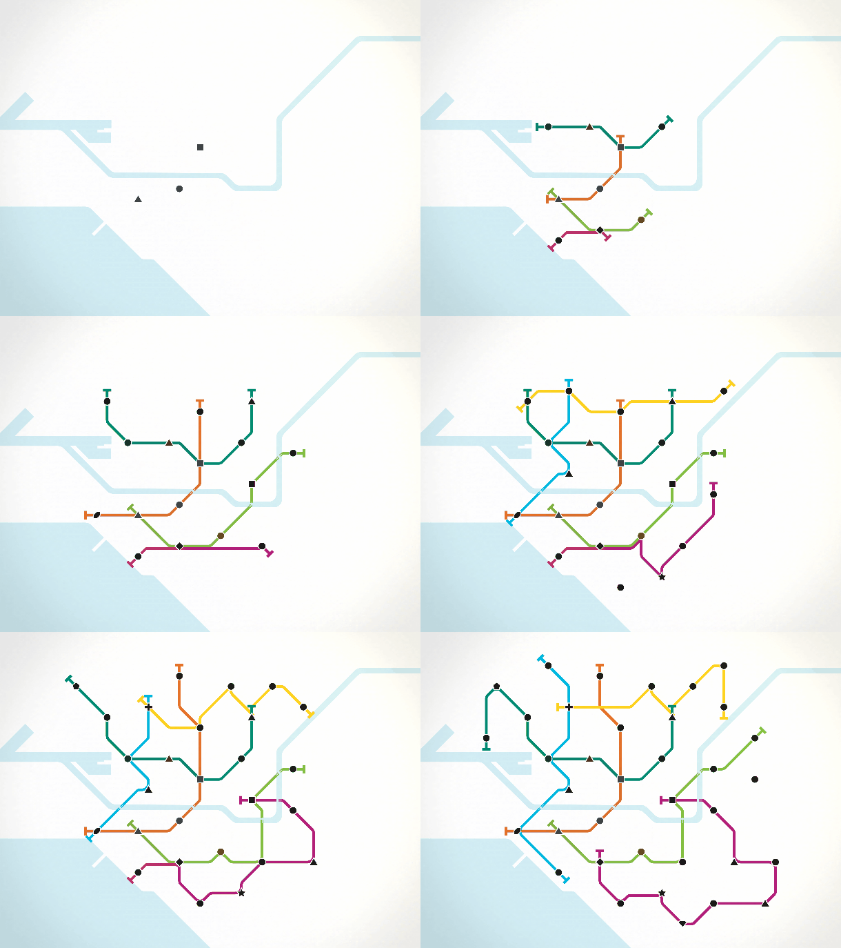
Over the past two months, I have played the mobile game Mini Metro (Dinosaur Polo Club, 2015) while riding three different metro systems: the London Underground, Toronto’s TTC, and the DART rail during my morning commute in Dallas. The convoluted networks of transport that I must build for the game often contrast with the simpler designs of the transportation systems in Toronto, which resembles an undone fastening pin, and in Dallas, which approximates a half-squashed cellar spider. The famous London Underground, with its uneven inter-station distances, line redundancies, and far-flung endstations, looks more like the mess of colorful lines I come up with right before losing — it is, in fact, the first level of the game. Confronted by the seeming immutability of these real-world systems, one becomes fascinated by the endless plasticity of their playworld counterparts. Playing the metro while riding the subway belies the idealized notions of subways that Mini Metro purports. What sorts of fantasies about urban transportation infrastructure does this casual game enable?
Mini Metro is a mobile game whose basic premise is to build subway systems. Each level is represented by a city in the world, and leveling up consists of achieving a prescribed minimum score per city. In its competitive mode, a clock on the upper right hand corner marks the passing of weeks. Every Monday, the player unlocks new tools: a choice of vessel (regular trains, fast trains, small carts) and a choice of infrastructure (tunnels, bridges, new lines, interchanges). Until the next Monday, one must manage the emergence of new stations and the fluctuations in rider density with the tools available at the beginning of the week. A player loses when a station becomes overcrowded. The challenges across different levels include covering an extensive area with only a handful few lines, devising systems across bodies of water, and handling swift population outbursts. Although the geography of these global cities inspires the levels, the location and number of stations, as well as the crowdedness of individual stations, are determined by the game’s algorithms. In practice, Mini Metro reduces transportation logics to the mediation between preset environments and randomly generated human demands on them.
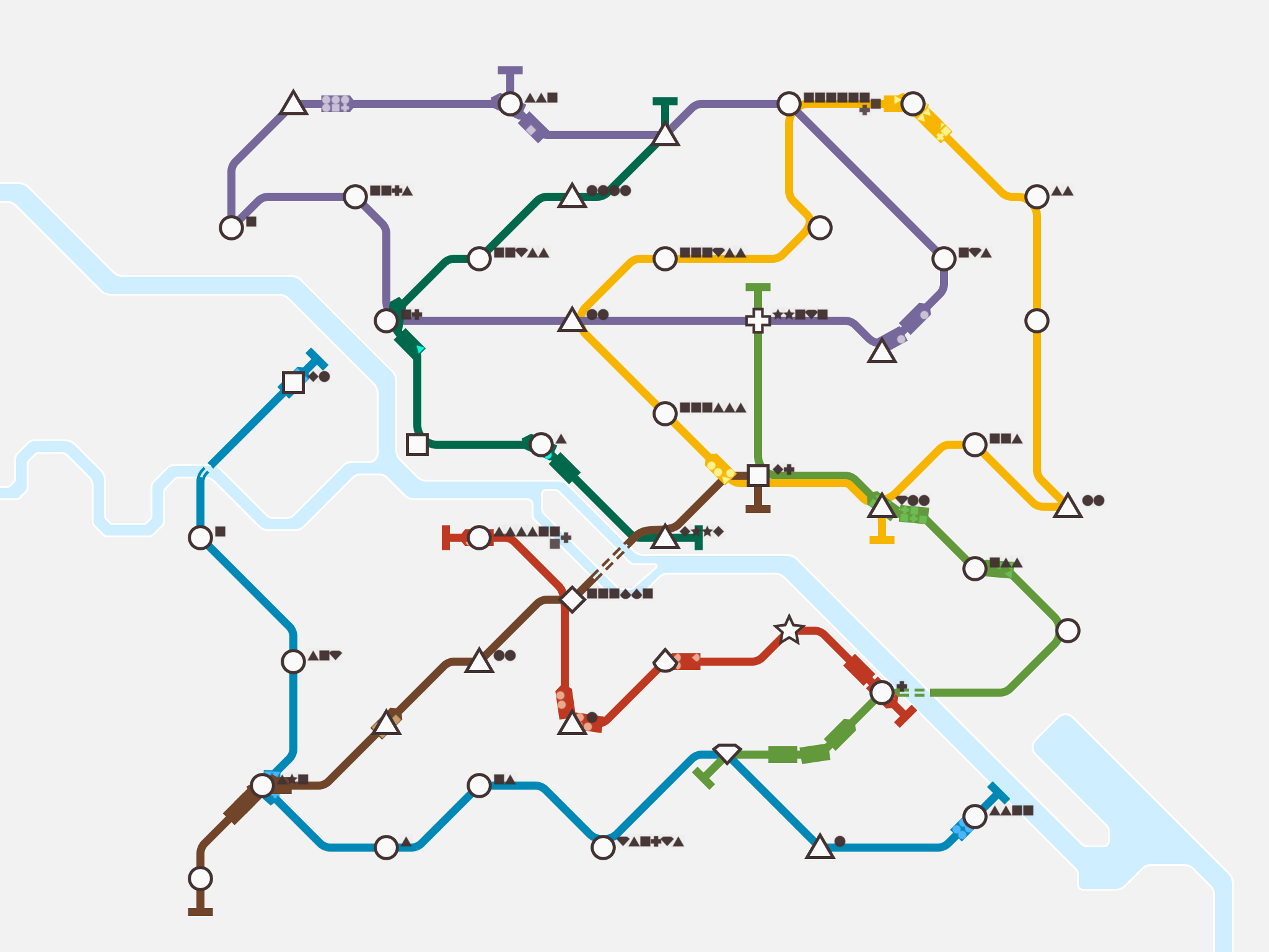
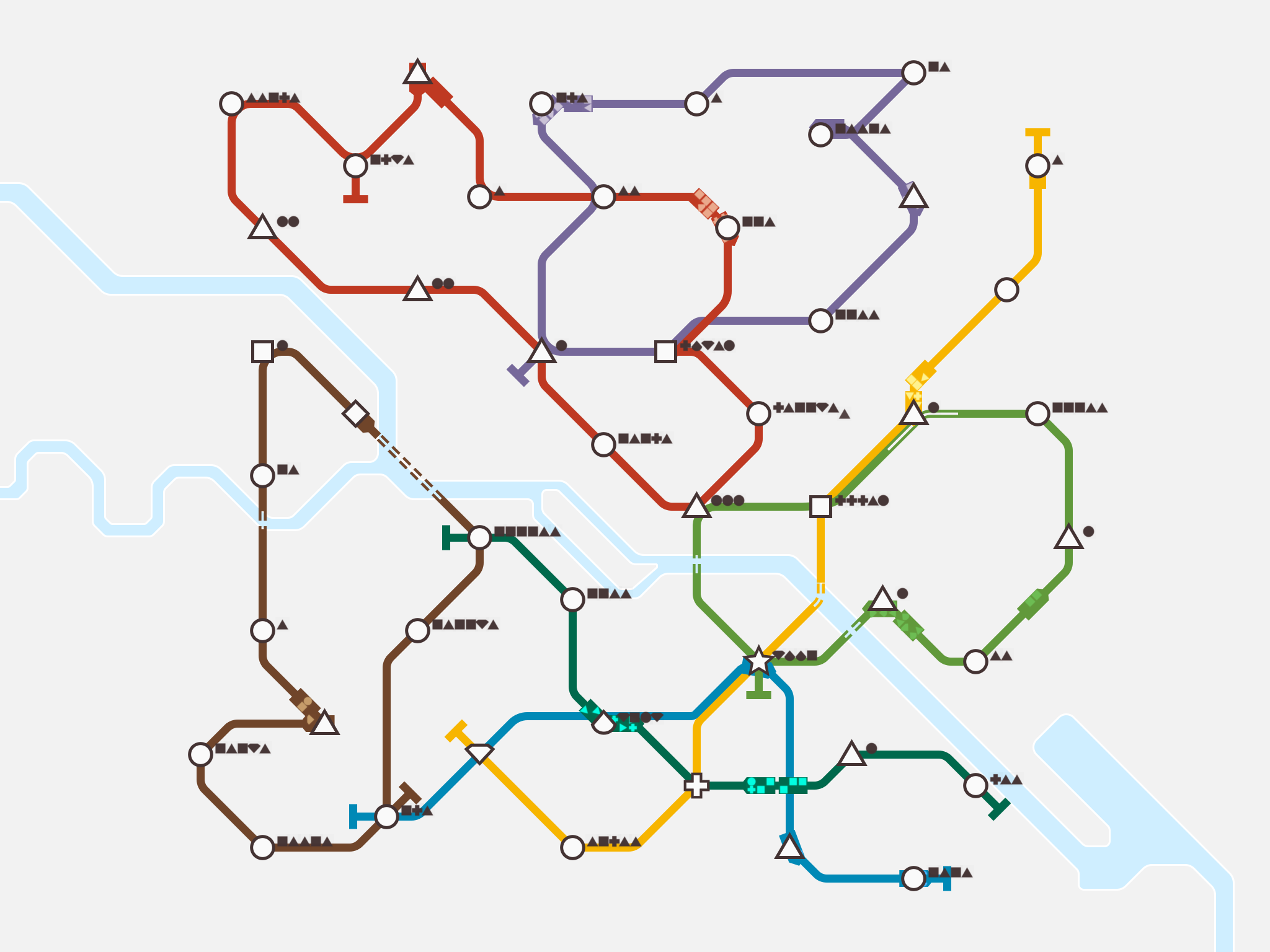
Mini Metro participates broadly in what Shannon Mattern calls “playing infrastructure,” projects that engage with the temporal dimensions of an infrastructure and illustrate its mutability and transience. [1] The game showcases a basic problem of building a public transportation system: how to move hundreds of people across an urban landscape with few resources in the least amount of time. Throughout its early launch, the creators of the game framed their creation as a way to speak to this problem. Designer Peter Curry stated that users would inform him that “by playing Mini Metro, [they] have gained an appreciation for the difficulties that their own city’s metro planners have, and they don’t mind the odd delay to their commute as much as they used to. It’s a pretty good feeling to have added a little empathy to the world.” That little empathy that Curry celebrated in 2016 may have now dissipated in the wake of the continuous crises of the New York City metro system, or indeed many other global cities.
While the casual gaming that Mini Metro provides functions as an entry into some of the complexities of urban planning and population management, the game extends the mutability of this urban infrastructure in realistically untenable ways. Players can completely undo the track of one line or reassign trains from one line to another immediately. Winning at Mini Metro requires mastering randomly generated mini-crises of overcrowding and odd station placement, not the complex interrelations between privatization of public goods, zoning and redlining, and environmental impact factors, among other things. What becomes readily apparent is that Mini Metro is not as faithful to the logics (much less the politics) of subway planning and building as it is to the aesthetics of subway visualization. It is about what gets communicated when the subway becomes an aesthetic for cognitive-spatial connections.
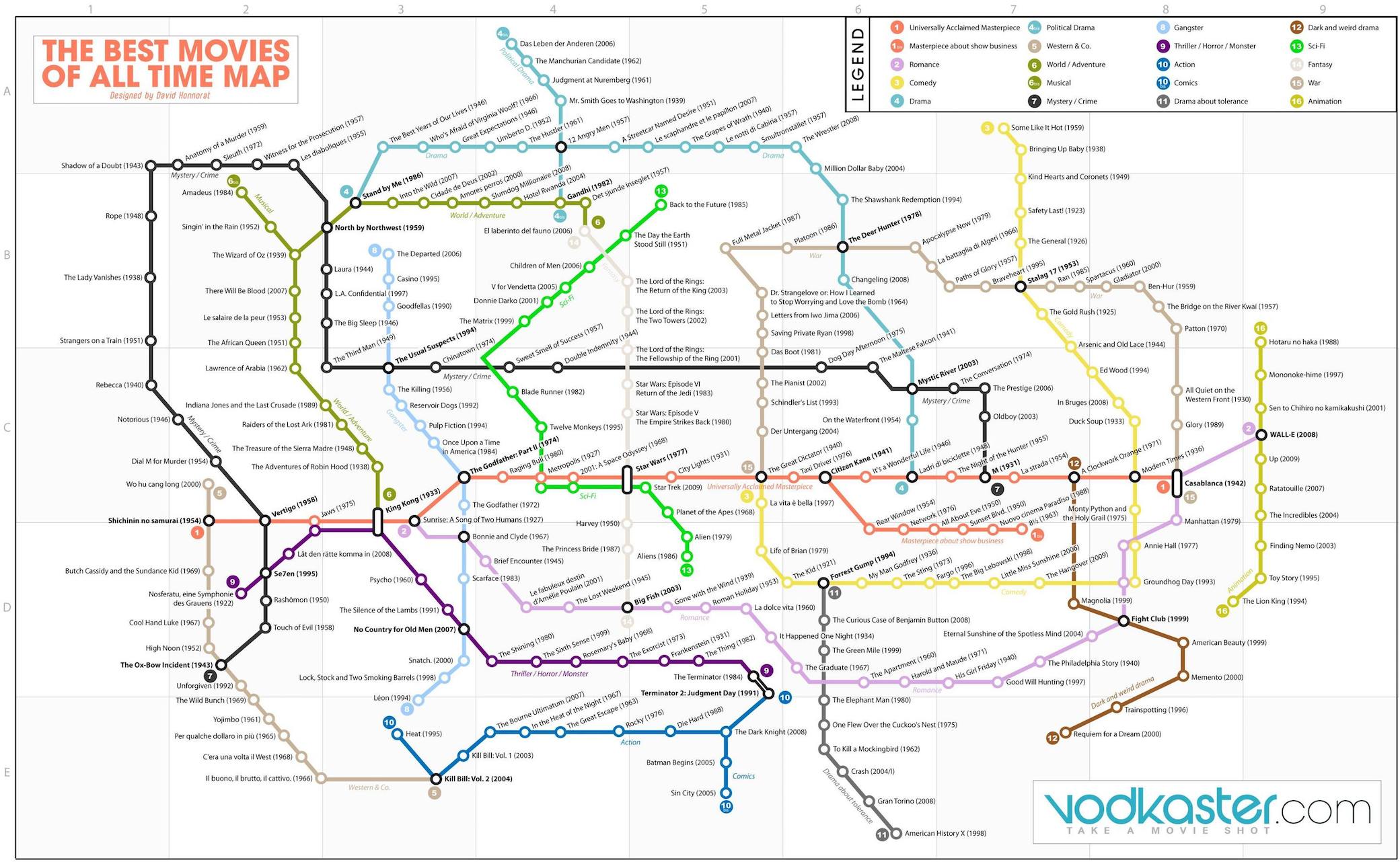
The appeal of subway aesthetics reaches farther than this one mobile game. The popularity of the book Transit Maps of the World across museum shops, for instance, indexes a cosmopolitan fascination with the look of subway systems. Designers obsess over the precision, scale, and clarity of subway maps. Even mainstream publications pore over the particularities of how subway maps got their color and font choices. Subway aesthetics have proven resilient enough for playful re-imaginings of other historical transportation infrastructures, such as the Ancient Rome system of roads, and for politically motivated recastings, such as the Gaza Underground. The public fascination with the aesthetic rendering of a city’s transportation system helps explain why rivers and bays are one of the few real-world referents that Mini Metro retains in its level designs. As Ian Baldwin points out, the outrage from Londoners and New Yorkers when new subway maps erase the cities’ rivers and bays speaks less to the wayfinding work these bodies of water may perform than to their iconic role as placemakers in the civic imagination. [2] The clean, colorful lines of the metro and the water thruways these lines intersect construct a pleasing, unpolluted picture of the global city for local and international audiences alike.
Amidst this aesthetic fetishism, the cuteness of Mini Metro is, therefore, not incidental. In a previous column I argued that the cuteness of digital platforms represents an aesthetic encounter with the exaggerated power differential between the individual and contemporary global networks of communication. [3] A cute interface can alternatively mask, foster, and undermine the struggles over control of public, yet increasingly privatized, infrastructures. Calling it a mini metro, a pocket-sized rendering of the transportation network encountered daily by citizens of international metropoles, re-signifies this infrastructure’s monumental scale and power into a manageable, cute, and playful dynamic. Like the colorful tubes of the Google data centers, the lines in such subway animations recast the encounter with technological sophistication as an instantly apprehended aesthetic encounter. In doing so, they risk obfuscating the materiality of and politics at play in these avenues for transportation and communication.
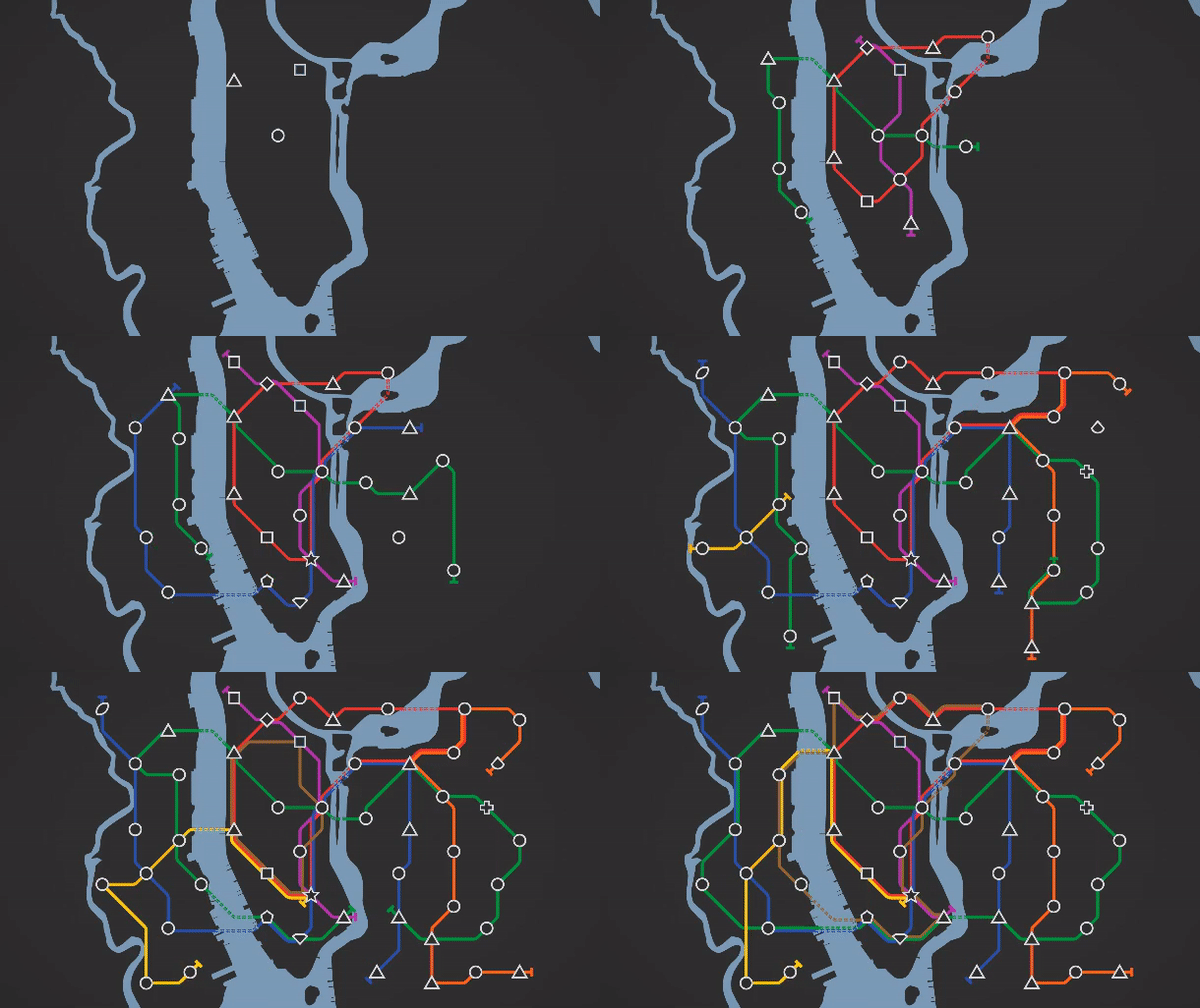
Mini Metro, however, plays up aesthetic fascination as a corollary to, or an inherent part of, technical dexterity. In its endless mode, the game does away with the temporal logic of a weekly clock and unlocking new tools is instead achieved by reaching a certain number of passengers in circulation. Once again, players can undo and redo entire tracks and move cars from one line to another instantly. Overcrowding does not make the player lose; it merely reduces the number of passengers in circulation and the ability to unlock new tools. Endless mode thus only ends when the player chooses to, when s/he becomes bored with the current organization of lines or frustrated at his or her inability to facilitate more passenger circulation. Absent the pressure of losing to overcrowding, form surpasses function as the site of interest. Players are incentivized to create more efficient subway systems and more aesthetically pleasing ones. Indeed, as indicated by the dozens of user-made designs that populate social media accounts such as MiniMetroMaps, the game suggests that a more efficient grid and a more beautiful one may be one and the same. The game fuses the appeal of subway design aesthetics with the joy of hacking the game’s protocols to create a beautiful, efficient system. Interpreting the allegorithm [4] of Mini Metro’s endless mode means decoding this symbiosis between beauty and efficiency. In an era when real-life subways are the locus of struggles over public stewardship, the idea that a metro can be beautiful and efficient if only its planners were given enough time seems like the ultimate design fantasy.
Image Credits:
1. Stop motion capture of the construction of Melbourne’s subway lines in Mini Metro (Screengrab of author’s gameplay)
2. Two versions of the Berlin subway from Mini Metro. Stations randomly sprout up in different locations based on the game’s algorithm (Screengrabs of author’s gameplay)
3. Subway aesthetics used to map out film categorizations
4. New York City metro in infinite mode
Please feel free to comment.
- Shannon Mattern, “Infrastructural Tourism,” Places Journal, July 2013, https://doi.org/10.22269/130701 [↩]
- Ian Baldwin, “Mind the Map,” Places Journal, October 2009, https://doi.org/10.22269/091008 [↩]
- Juan Llamas-Rodriguez, “The Cuteness of Tunneling Media,” Flow TV: A Critical Forum on Television and Media Culture (October 30, 2017) <https://www.flowjournal.org/2017/10/the-cuteness-of-tunneling-media/> [↩]
- Alexander R. Galloway, Gaming: Essays on Algorithmic Culture (Minneapolis: University of Minnesota Press, 2006): 91. [↩]
Spider Solitaire+ is a nicely realized version of Spider Solitaire that has fair graphics, it operates smoothly, it is least space cover, and it runs without lags or crashes. which includes unlimited undo’s, smart hints, and the ability to add your own points into the game.