The Golden Age of Television (Cinematography)
Christopher Lucas / Trinity University

Television and feature film cinematography have long been treated as fairly distinct areas of practice. My past research, for example, focused on feature film cinematographers, in particular their discourses of professional and aesthetic value, and how they navigate technologies that disrupt their production culture. I kept television at arms length in that research as it was a distinctly different work environment from feature films. Recent developments in television production, though, suggest that those distinctions – while not falling away entirely – are beginning to shift. Authorial discourses, as John Caldwell has written, are domains of significant contest in an industry where the boundaries that inscribe above- and below-the-line work represent real frontiers of wealth and prestige.1 These fault lines of professional value and hierarchy are felt within craft areas as well, and television’s recent embrace of complex imagery and visual flair has, to some extent, shifted discourses of craft value as new creative possibilities emerge for that medium’s below-the-line professions.
Of course, high-end, or “cinematic,” visual style has long been a marker of the “quality” end of the programming spectrum on television. Jeremy Butler, among others, has traced how various genres of television have adopted single-camera and other cinematic flourishes over the years—often in piecemeal fashion, as a signifier of quality.2 Hill Street Blues (1981-87) pioneered a more low-key, naturalistic style that was very influential and other series followed. Other programs flirted with self-consciously cinematic one-off experiments and there have been many stand-out programs like Thirty-something, Twin Peaks and Homicide: Life on the Streets with memorably expressive photography. In general, though, television cinematography has been limited by broadcaster demands for amply lit sets and faces, and a lack of time (and budget) to create careful effect lighting, colors, or compositions. This difference of creative possibility did much to sustain an unspoken caste-system within cinematography, a hierarchy in which the feature film represented a creative and professional North Star.
Television’s new competitive landscape has contributed to the erosion of that hierarchy. Cable (subscription and paid) and digital platforms have used quality drama to forge a place for themselves in popular culture, and in these productions the cinematographer has found new prospects for creative distinction and professional reward. My discussion here is by no means exhaustive, but, using reports from productions of AMC’s Breaking Bad, HBO’s Boardwalk Empire, and the Netflix series House of Cards, I hope to introduce a few lines of inquiry around the production culture of television cinematography and I welcome your comments.
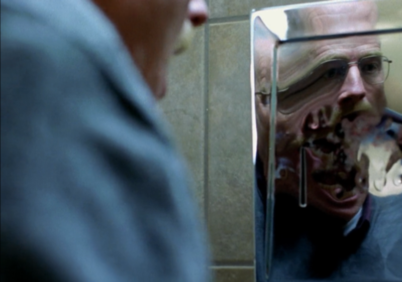
The cinematography of Breaking Bad developed following a pattern that seems increasingly common: involving “name” feature film talent (in this case, Oscar-winner John Toll) to help create the pilot. Reynaldo Villalobos, an experienced, older journeyman DP, finished off the first series of six episodes. In the second season, though, showrunner Vince Gilligan hired Michael Slovis, whose work extended and shifted that of Toll and Villalobos to establish the program’s signatures of sharply saturated tones, complex chiaroscuro, use of motivated light, and slightly wacky POV shots. Slovis was formerly one of several cinematographers for the CBS series, CSI, a program also known for a distinctive look, although in a blaring, high key and quick-cut style that quickly became formulaic. All told, Slovis photographed 50 episodes of Breaking Bad and directed four others, and he describes his experience on Breaking Bad as a break from past practice, largely thanks to AMC’s need to create distinctive programming: “It had one original program going on, Mad Men, and they were just starting to build their brand…so, they said, “We know what we’re asking; we’re filmmakers, and we want you to do this.” As a result, Slovis said, “I have been given an extraordinary amount of freedom, never before seen by me in television, and very rarely given to anybody.”3 We might see Slovis is an example of the cinematographer at his or her most authoritative in the new production culture of television—given wide latitude to experiment, create, and collaborate with others on the team and largely responsible for the look of a series across its run.

Boardwalk Empire follows a more common template, in which a small group of cinematographers alternates duties, temporarily paired with each episode’s assigned director. The challenge with this “team” approach for today’s productions is maintaining a consistent look when cameras and digital tools allow so much flexibility in creating and revising images. Many programs create a “look book” that becomes a guidebook for the series’ cinematographers and other craft areas. However, Boardwalk’s pilot, directed by Martin Scorsese, and photographed by Stuart Dryburgh, ASC, did not generate a look book.4 Jonathan Freeman (who completed the first season, alternating with Kramer Morgenthau, ASC ) reported that in the absence of an established look he and Morgenthau had some freedom to develop unique looks for each episode, treating each as a “mini-movie.” Freeman specifically mentioned the painterly Ashcan School as reference point for his episodes.5 Still, the team works in close collaboration: watching each other’s dailies, visiting each other’s sets, sharing much of the same crew, and coordinated some basic stylistic elements, such as avoiding practical electric lights much of the time (except on the Boardwalk), avoiding primary colors and consistently de-saturating images to support the period mise en scene.6 In this model, the control of the look is relatively loose, but the team works together to maintain consistency across the series based on the look of the pilot.
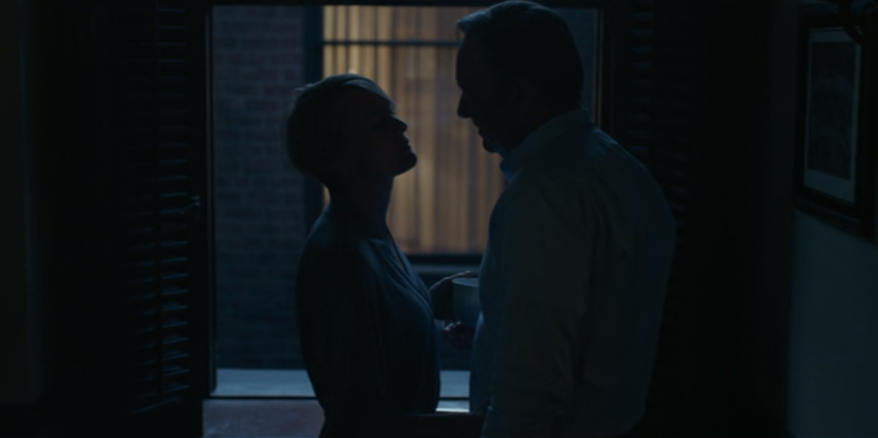
In my final example, House of Cards, we see a much higher degree of control from the program producer. Series executive producer David Fincher directed the first two episodes with Danish cinematographer Eigil Bryld and Bryld stayed on to photograph the next nine episodes. Igor Martinovic, a relatively young cinematographer best known for his documentary work, took over in the second season.7 Unlike my previous examples, the look of House of Cards was largely established in an intensive 10-week preparation cycle in which the workflow of the series was thoroughly mapped out. In most productions, the cinematographer’s vendor relationships (with Panavision, for example) would be crucial in this stage – however, it was Fincher’s relationship with the Red Company that held sway here—the program is shot in an unusual 2:1 aspect ratio, using the Red digital cameras that Fincher has used on every project since The Social Network. According to Bryld, much of this time was spent designing the camera package, custom-building a camera truck, and absorbing Fincher’s stylistic ground rules, such as prohibitions on Steadicam, handheld, or zoom shots. Motifs such as having Frank emerge or disappear into darkness, or using more uniform, bright colors to signify settings close to power were also discussed. Two camera set-ups were used regularly, limiting lighting and other cinematography options, and the intensity of the shooting schedule kept Bryld from being involved in post-production.8 This degree of pre-planning and on-set control doesn’t negate the creative role of the cinematographer, but the sum of these seems unavoidably to shift control of the look toward the producers.
In the past, limitations of budget, schedule, and the home viewing experience have created obstacles to scripted television that aspired to a fully “cinematic” look. Over the last decade, though, the crafts that supply cinema with its distinctive artisanal feel—cinematography, editing, production design—have moved to the foreground in television and more daring, ambitious visual styles are the result. Certainly, this new ambition owes much to producers’ willingness to define (or defend) a novel look against the concerns of studio executives (although in some cases, as we’ve seen, executives are demanding more distinctive looks). The efficacy of new, lower cost imaging technologies, tools for look management, and the better home screen are important aspects here, too. However we parse its source, the emergence of a more ‘cinematic’ television raises questions about long-standing verities within cinematography’s professional and stylistic hierarchies, as well as our sense of the complexities of authorship in television’s latest “golden age.”
Image Credits:
1. House of Cards
2. Breaking Bad
Please feel free to comment.
- Caldwell, John. “Authorship Below-The-Line,” In A Companion to Media Authorship. Jonathan Gray and Derek Johnson, Ed. (Wiley-Blackwell, Malden, MA, 2013). [↩]
- See Jeremy Butler, Television Style (New York, Routledge, 2010). [↩]
- Both of these quotes from Dave Bunting, “Gliding Over All: An Interview with Michael Slovis,” on Rogerebert.com (August 7, 2013). Other suggested reading: Silberg, John. “Pressure Cooker.” ICG Magazine 84.1 (January 2013). [↩]
- Thomson, Patricia. “Mob Money.” American Cinematographer 91.9 (September 2010), 34. [↩]
- “A Salute to the Emmy Winning Cinematographers.” American Cinematographer 93.11 (November 2012), 86. [↩]
- Thomson, Mob Money. [↩]
- “Below-the-Line Impact Report.” Variety Online. (July 29, 2014). [↩]
- Calhoun, John. “Power Plays.” American Cinematographer 94.2 (February 2013), 18. [↩]
Pingback: Golden Age of TV Cinematography | sebastian mantilla filmmaker
Pingback: Blog Five – A(ce) Posteriori