Watching Time on Television
by: Daniel Chamberlain / USC
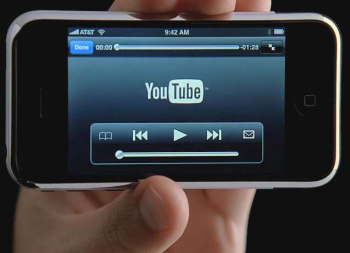
It has become nearly axiomatic that emergent media technologies are dramatically impacting the fundamental temporalities of television. Often cloaked in the hype-friendly language of the gadget industries — time shifting, webisodes, place shifting, mobisodes — the general tendency of such pronouncements is to emphasize the control viewers gain over when and where programming (and if and how sponsorship) is consumed. The public face of this transformation is embodied by high-profile companies like TiVo, which emphasize viewers’ ability to record, pause, or skip television programming, and YouTube, which promises viewers the chance to avoid television altogether, but these are merely the best known among a host of technologies and services that challenge the decades-old practice of watching television programming in broadcaster-scheduled half-hour and hour-long blocks of time. While the ability to watch an hour of prime time television in forty-two minutes, at four in the morning, in a plane, on a mobile phone, is certainly a break from an earlier era of television, celebrations of temporal mutability have overshadowed the importance of a related phenomenon, temporal conspicuity.
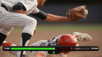
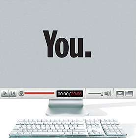
Watching time is now part of watching television. Once a structuring element in the presentation of television, time is now directly made part of the image through the media interfaces that govern access to content. This phenomenon is probably most familiar to TiVo owners, who conjure an informative and affirming time bar each time they pause or fast-forward through programming. This simple graphic concisely indicates the length of a recorded program, the portion of a program already captured, the current progress through a program, and the speed at which the video is being played back. YouTube, the standard bearer for web video (including many captured television clips), constantly displays a video toolbar, including a progress bar and current/total time display, as well as interactive controls for manipulating video, audio, and display preferences. Perhaps more importantly, YouTube also prominently foregrounds the total length of each clip in many of its video listing guides.
In an attempt to keep up with the changing technological environment, the major broadcast networks all stream selected series and episodes on their websites using a variety of video players that similarly display time and related information. CBS’s Innertube uses Real Player to serve video, providing information similar to that offered by YouTube. NBC, using a Flash player, provides a different set of time-related information. An area below the video player indicates the segments (often mapping to act breaks) available, and a time indicator in the video control bar counts the currently playing segment down to zero; unlike CBS, total program length is not provided. ABC’s customized video player streams Flash video and provides a segmented time bar as well as total running time. In the network cases, of course, the programming is not simply broken down into clips for ease of access, but because the privilege of viewing each segment is earned by first watching a commercial. The ABC player even gives a thirty second countdown as the commercial plays, making the time of advertising as apparent as the time of programming.
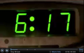
pilot episode of Daybreak
Regardless of the display technology, software platform, or content delivered, the prominence of temporal metadata associated with watching video in these emergent contexts alters one’s relationship to the video itself. When watching television in this manner the obvious temporal cues make it difficult to get lost in the story. I constantly catch myself glancing at the displays, hyper-aware of the narrative trajectory because I know exactly how much time is left. My pleasure in watching a dramatic scene is tempered when I know that there are precisely thirteen seconds left, and my uncertainty regarding an episode’s likely narrative closure is altered by my knowledge of its temporal progress. Occasionally, I even get caught up wondering why one segment of Lost on the ABC site is fifteen minutes long while the next is just three or four. To be sure, US television has long signaled the constraints and peculiarities of its temporality through its rigorous adherence to hourly and semi-hourly program starts, its regularized act and commercial breaks, and a varied assortment of strategies to maintain interest across the programmed flow. Yet none of these techniques is so bold or affecting as to actually foreground time as a visual element.

On the few occasions where temporal representation has been directly integrated into programming, such as with the “real-time” clock on Fox’s 24 or the “22:00”-minute countdown clock in the first few episodes of NBC’s 2002 series Watching Ellie, the technique was so striking as to dominate initial critical and popular discussion of the programs. In the half-decade since these experiments debuted, time displays have not caught on as a widespread trend for scripted programming, but have instead become integral features of the media interfaces that overlay television. 24‘s pre- and post-commercial ticking clocks are analogous to the TiVo time bar often summoned at commercial breaks, and Watching Ellie’s countdown clock functions similarly to the timers on YouTube and the broadcast network sites. Yet even as the temporal cues provided by media interfaces perform a similar function, their incorporation into such interfaces has freed them from the critical scrutiny which attended their presence in programming.
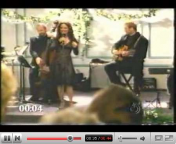
As television becomes a multi-platform viewing experience, time bars and elapsed-time displays serve both functional and aesthetic purposes. In the case of Current TV’s dual-platform approach, time indicators on the website, like at YouTube or most any online video site, provide information that eases interactive engagement with clips. Similar time bars on Current’s television broadcasts are primarily aesthetic flourishes indicating that the network’s pod-based programming model is rooted in a new media environment, but also serve the function of providing temporal cues to viewers unfamiliar with variable-length programming. The result is a striking departure from the standard television viewing experience, as the progress bar both informs and distracts from the content it describes.
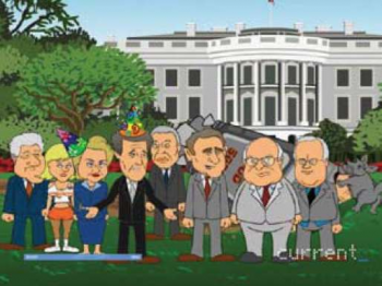
The conspicuous presentation of temporal information works beyond just providing a constant reminder of how a program’s narrative is working against time constraints. Fundamentally, the ubiquitous display of time is a reminder and invitation to viewers that they have the ability to manipulate their television controls. Regular engagement with temporal metadata even changes related viewing practices, leading viewers to call up metadata screens when watching films on DVD or growing antsy in situations where temporal cues are not as directly available (such as watching a film in theatres or watching live television without an interface).
In online contexts — visiting the YouTube site, for example — clip length is a crucial piece of metadata, along with title, rating, number of views, and submitter, that allow one to decide which clips to play. A ten minute clip might seem like a waste of time, whereas a fifty second clip or two might appeal as a pleasant distraction. Or consider how this dynamic works for Current TV. What effect does clip length have on how viewer created content is evaluated? Might a five minute pod receive a “greenlight” rating while a longer or shorter piece gets rejected out of hand? Is it that some types of content have natural lengths that make them more attractive, or that the length itself is both a prominently displayed aspect of the program and de facto criteria for evaluation, even before a clip is viewed?
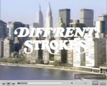
featuring five-minute long edited episodes of kitchy programs
What remains to be seen is if and how temporal conspicuity will work into the array of factors putting pressure on standard program lengths. Already we see HBO giving limited flexibility in running length to most of its marquee programs, stunting with non-standard lengths of NBC programs like The Office, extended versions of certain shows on DVD, shrunken versions of kitchy classics, and block programming with multiple consecutive hours of shows like 24. As these and other programs are increasingly viewed in contexts that foreground their temporal parameters, and as more programming, like the WB YouTube NBC defunct(?) show Nobody’s Watching, is produced for non- or peri-broadcast environments, time indicators and descriptors will increasingly become more powerful elements of the viewing experience.
Image Credits:
1. Apple iPhone
2. Widescreen TiVo HD Progress Bar
3. Time Magazine Person of the Year, based on YouTube Video Toolbar
4. ABC Full Episode Player, showing temporal details of the pilot episode of Daybreak
5. “Real-time” clock from Fox’s 24
6. Competing timers — Watching Ellie on YouTube
7. Current TV’s SuperNews, featuring televised progress bar
Please feel free to comment.
Your observations certainly hold true to my experiences watching TV online and on tivo. I’ve become so accustomed to the “progress bar” that I sometimes feel restless in movie theaters now, where I am not always sure of my place in the narrative.
It does strike me, though, that much of what you describe was preceded by the digital interfaces used for listening to music through the computer; in this case, the time awareness you describe goes beyond new modes of televisuality and gets ensnarled by issues of media convergence. Also, I began getting time-obsessed about movies first with my DVD player, which would tell me how much longer a film had through an on-screen display.
Temporal conspicuity… A thoughtful piece on a topic not often analysed. It will inform my further thinking with regard to the issue of ‘duration’ or content length.
In the context of television broadcasting here in the Middle East the ‘time-is-money’ disconnect is evident. We’ll be asked to give 8 minutes to a package which elsewhere would be a 3’30”, a subject worthy of a 13 minute documentary is inflated to a full television hours, and a variety show of under two hours is deemed a non-event.
The upside is that out here I have all the time in the world to muse over such things and to enjoy the posts on FlowTV!
Thanks for the interesting column, Daniel.
Like Dan, I too have long relied on my DVD’s timer to help me forecast my movies’ (typically) three-part dramatic act shifts. Interestingly, it was only *after* I bought a player without a time readout that I realized my chronic viewing habit.
My DVR-dominated TV viewing has also impacted my reception of live sports. I enjoy replaying those plays that aren’t attended to by the broadcasting team, even as I find myself repeatedly and vainly (if not neurotically) tapping the fast forward button to skip the overplayed replays and live commercials.
What’s next, a TV-clip shuffle?
After joining the iPod nation, I have found myself increasingly incapable of listening to a song all the way through on my portable music device. In part, this is due to looking at the time-bar on the bottom, and once I am aware that I am past the part I “like the best” or that there is only the fade-out to go, I click to the next song.
I wonder, as TV moves increasingly to these portable devices, will viewers become so accustomed to shuffling and clicking between shows before they finish that our attention spans will decrease even further?
Great column Dan. It makes me wonder how the “progress bar” function would or could work in a movie theater setting. On my DVD player, I occasionally check the timer to see how much time has passed but that seems different than seeing how much time is still left in a movie. If audiences increasingly rely on this function on-line or through their at-home TV technologies (TiVo, etc.), will it translate onto the big screen? It could easily function as a welcome count down timer before the movie begins. (You know, so you’d know if you had time to go to the bathroom or spend approximately $146 on popcorn and soda before the movie begins.) But during the movie, would it be a distraction?