On Seeing What’s Next: Netflix’s Personalized Interface Versus Users’ Personal Browsing
Latina Vidolova / University of Texas at Austin
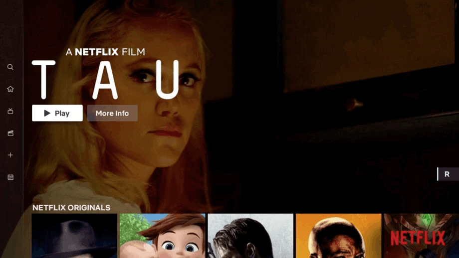
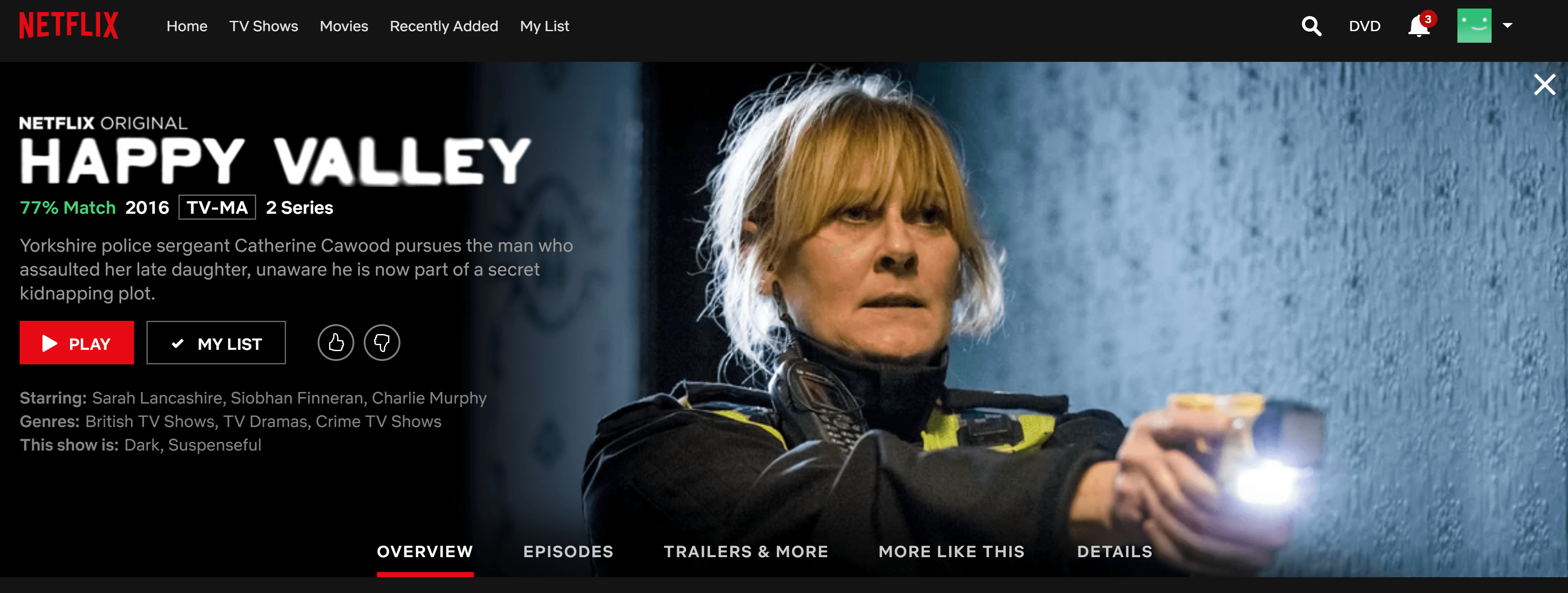
In summer 2018, Netflix began to roll out, alongside other changes to the user interface for television devices, a fullscreen preview trailer that autoplays above sections of tiled content suggestions. This feature amplifies another interface change in late 2016 that replaced still images with video previews as users linger over a selection. The combined effect is sometimes a sensory barrage, leading director Rian Johnson to joke that his favorite console game is “navigating Netflix without triggering autoplay promos” and satire news site Hard Drive to write, “Netflix Now Autoplays Trailer If You Even Think About Opening Website Up.” Netflix Director of Product Innovation Stephen Garcia explained the 2016 change saying, “Television has decades’ worth of expectation that when you turn it on, the video and audio play. So it’s actually quite strange to have a silent experience.”
Curiously, this statement comes from a company that, as television scholars like Timothy Havens have thoroughly chronicled, “champions a disruption of scheduled television viewing” and leans on “its identity as a tech company, as opposed to a media company.” [1] Netflix has invested a lot of energy in framing its service as unlike television, as harnessing technology to create something new and better. For Garcia to say Netflix should be more like television appears out of place.
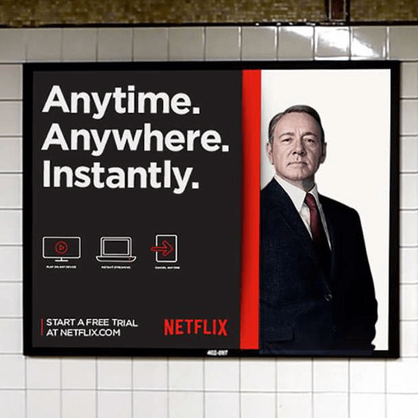
Nevertheless, maybe this kind of angling should not be surprising. Ramon Lobato notes that Netflix strategically presents itself to suit particular situations. For instance, Netflix acts as a tech company when dealing with governments, hoping to evade the pesky regulations stamped onto national television, but it refers to itself as television in public relations “because of [television’s] familiarity to consumers.” [2] Garcia’s statement, then, might be understood as encouraging subscriber comfortability with a change that he reassures is as familiar and old as television.
What is interesting to me, underneath the strategic dimension to representing Netflix as like/unlike television, is how, adjacently, Netflix imagines subscribers and their relationship to the service. When Netflix declares itself old and familiar, it presents passive positions to its users; when Netflix indicates its service is new and disruptive, more active positions open up. A conflict between empowering users or curtailing them plays out in the design of Netflix’s interface.
I want to take a closer look at the historical trajectory of Netflix’s user interface. [3] In different contexts on the site, Netflix seems to suggest users are in charge or users should sit back and let Netflix make their entertainment decisions. This modulation reveals how Netflix both makes users feel empowered and guides and shapes their activity in a form most productive to Netflix.

The user interface in 2010 resembled a digital video shop, with images of DVD covers in rows under broad genre labels. At the time, a video shop aesthetic reflected both Netflix’s roots as a DVD rental company and Netflix’s desire to differentiate its service from regular television. Like borrowing a DVD and unlike watching broadcast and cable television, Netflix would allow users to control the selection and scheduling of their viewing.
In the next few years, Netflix allowed some of the granular metadata it developed for improving recommendation to manifest on the user end, transforming data into pleasurable ways to traverse Netflix: scrolling through categories with inventive names, clicking through emotive tags, discovering new media grouped with familiar. Television scholars have remarked on how Netflix promotional material from the early 2010s emphasizes their users in action; as Netflix imagines it, even when bingeing, they are dynamically seizing their entertainment on their terms instead of succumbing to the massive time suck of television. [4] Similarly, the long list of datafied and categorized choices on Netflix encourages scrolling and sorting “as the sovereign navigator-user of an endless archive of screen content.” [5]
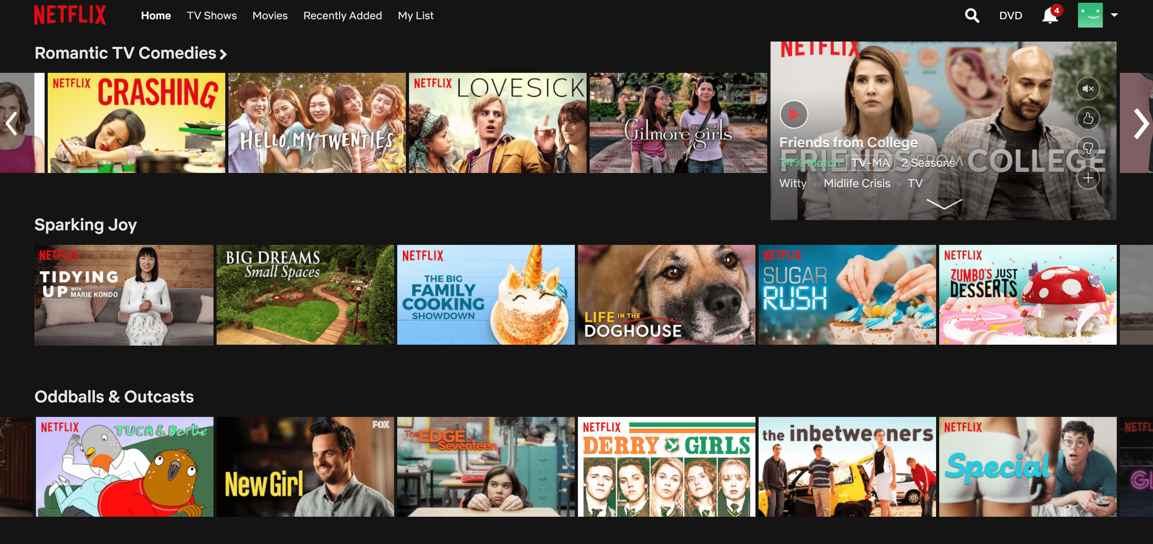
However, the catalog layout has always been paired with top picks or “trending now” choices toward the top that urge users to stop browsing and press play already. Since 2018, Netflix foregrounds curated selections even more emphatically with the auto-preview feature. As Garcia explains, “sometimes our members need a little bit of help figuring out” what to watch. In an interesting reversal, then, Netflix has begun to emphasize not having to choose instead of choosing as the trait that makes users (technologically) empowered through their service. In the second half of the 2010s, Netflix further limited viewer activity on the service through eliminating user reviews, changing from a five star to a thumbs up/down rating system, and cracking down on use of VPNs to access geoblocked content and piracy after an initial attitude of permissive inattention. [6]
These changes suggest a passive viewership model that resonates especially when paired with Netflix’s rhetoric of customization. Netflix justifies putting selections in the faces of users because it assures that those selections are exactly the perfect recommendation, liberating the user from useless browsing.
Netflix has become a symbol of granular, incisive personalization in popular imagination, with the result that its business choices are often understood as giving subscribers what they want. In March 2019, subscribers noticed Netflix was experimenting with switching the episode order of its just-premiered anthology series Love, Death, & Robots. Right after a TechCrunch article pointed out a Netflix employee’s statement that episode rearrangement was a “100% random A/B test” not based on user info, the article still concludes Netflix’s actions are “yet another step toward a streaming landscape that’s increasingly tailored to our personal preferences.” There’s a jarring elision here between personalization and Netflix experiments to keep subscribers watching.
Netflix works to cement the equivalence between user desires and the interface. When users reacted poorly to a 2018 test to play video suggestions for other content in between episodes of a streaming show, Netflix released a statement that they “have been experimenting even more with video based on personalized recommendations” and they “are testing whether surfacing recommendations between episodes helps members discover stories they will enjoy faster.” Simply put, what users interpreted as advertisements, Netflix defended as time-saving personalization.
Instead of commenting on the effectiveness of Netflix’s recommendation algorithms, I argue there are differences between personalized and personal. Even if the episode order of an anthology series or video promotion matches a user’s profile, Netflix is asking users to buy into a linear experience where the only concern is to “see what’s next” as soon as possible. As Netflix CEO Reed Hastings dramatically stated in a 2017 earnings call, Netflix is “competing with sleep” to keep all of your attention and time on watching their media.
Gregory Steirer argues that, much like with a private collection of DVDs, actions going beyond one-time consumption give media objects personal value to people. [7] According to Steirer, organizing, searching for, owning, or even selling a collection of DVDs will foster a personal relationship to them; because cloud-based services for online consumption have severely limited the ways in which people may interact with media beyond consumption, they’ve thereby restricted personalization.
Accordingly, playing blaring trailers when Netflix starts up may redirect subscribers toward the primary intended use of Netflix—watching media—and discourage aimless browsing that ends with users not watching anything, but aimless browsing could nevertheless have personal value for users. To me, browsing on Netflix is a fun form of mental ordering where I navigate the seas of the Netflix universe, making unknown items known, affirming my relationship to familiar objects, reveling in imaginings of future possible experiences. Though a limited form of personalization, browsing allows me to connect to the media on Netflix on my terms. The more Netflix curbs these interactions to keep attention on pressing play on its original content, the higher the risk of breaking the illusion that Netflix isn’t just another media company.
Image Credits:
1. Netflix’s current interface
2. Netflix’s “Anytime. Anyplace. Instantly.” ad campaign
3. Netflix’s user interface in 2010
4. Netflix’s pleasantly categorized catalog. Author’s screenshot.
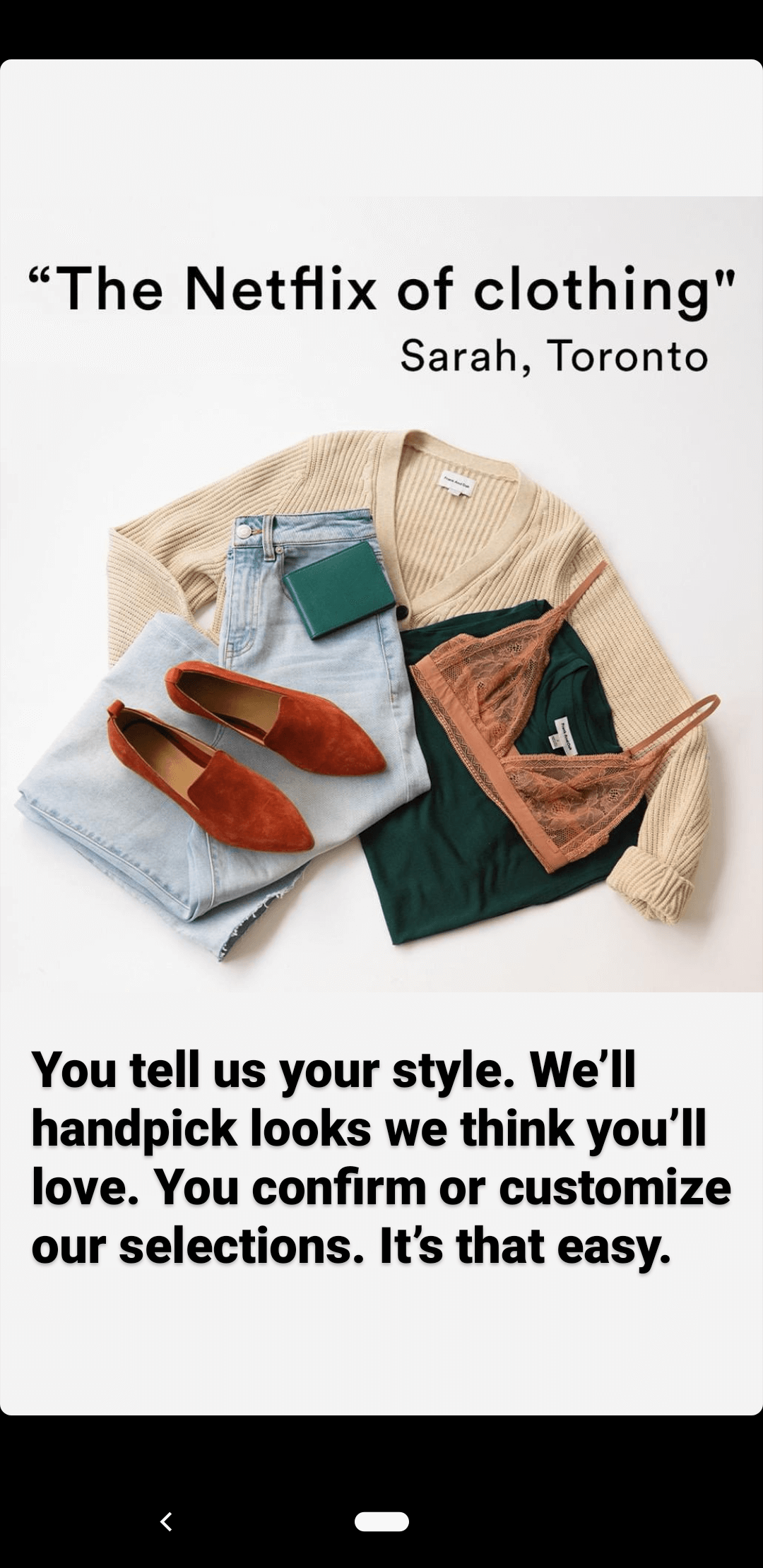
5. Frank and Oak ad. Author’s screenshot.
6. Netflix’s percentage rating feature. Author’s screenshot.
- Timothy Havens, “Netflix: Streaming Channel Brands as Global Meaning Systems,” in From Networks to Netflix: A Guide to Changing Channels, ed. Derek Johnson (New York: Routledge, 2018), 325–326. [↩]
- Ramon Lobato, Netflix Nations: The Geography of Digital Distribution (New York: New York University Press, 2019), 34. [↩]
- My approach is inspired by Mel Stanfill’s discursive interface analysis: Mel Stanfill, “The Interface as Discourse: The Production of Norms through Web Design,” New Media & Society 17, no. 7 (August 1, 2015): 1059–74, https://doi.org/10.1177/1461444814520873. [↩]
- See Havens 2018; Mareike Jenner, “Binge-Watching: Video-on-Demand, Quality TV and Mainstreaming Fandom,” International Journal of Cultural Studies 20, no. 3 (May 1, 2017): 304–20, https://doi.org/10.1177/1367877915606485; Chuck Tryon, “TV Got Better: Netflix’s Original Programming Strategies and Binge Viewing,” Media Industries Journal 2, no. 2 (2015), http://dx.doi.org/10.3998/mij.15031809.0002.206. [↩]
- Lobato 2019, 33. [↩]
- Lobato 2019. [↩]
- Gregory Steirer, “The Personal Media Collection in an Era of Connected Viewing,” in Connected Viewing: Selling, Streaming and Sharing Media in the Digital Era, ed. Jennifer Holt and Kevin Sanson (New York: Routledge, 2014), 79–95. [↩]