Bad Image, Good Art: Thinking through Banality
Robert Hariman and John Louis Lucaites / Northwestern University and Indiana University
It’s not difficult to imagine a fashion spectrum for the academic disciplines. Engineers (not all of them, of course) hold down one end, where you still find khakis and oxford shirts and even the occasional pocket protector. The visual arts define the other end, where piercings, painted hair, and grunge are taken for granted. As with any demographic grouping, typically there is more variation within groups than between them, but the tendencies are easy to see. And television/film/media studies, where does it fall? Well down the path toward the artistic side, of course. The right blue jeans, the expensive casual jacket, the shoes; all understated but unmistakable signs of a deft sense of style and spot-on reading of the advertising and entertainment media.
If you see only stupid stereotyping in this little conceit, then you might as well stop reading right now. And in any case, we are not talking about how you dress. It is the case, however, that academic cultures are taste cultures. Likewise, it cannot hurt to ask occasionally whether a shared aesthetic sense might be getting in the way of understanding the world””or changing it.
We believe that scholars in television and media studies (however they might dress) are keenly attuned to creative innovation and excellence. We think the point is obvious, although perhaps someone will want to stop here, arguing that actually the general aesthetic sense of the community is too narrow, reflecting a peculiar history, or otherwise problematic. For the most part, however, we are confident that many media scholars possess significant aesthetic knowledge, values, and discernment. Indeed, they are connoisseurs of the artistic condensation of the world that is brought to the screen: a world of the raised eyebrow, cigarette smoke hanging in the air, and all the other intensifications of everyday life, as well as the sleek contours of an automobile, office towers rising up out of a glowing cityscape, and other reflections of modern design. Even when focused on other dimensions of media production and use, and even when quoting Benjamin and warning of a fascist society of the spectacle, the work remains thoroughly at home within a sophisticated culture of taste.
And why shouldn’t it, not least if all cultures are taste cultures? What’s the problem? We want to suggest that there is at least one area where one’s aesthetic sense can get in the way: the economy. Let’s be clear: this is not a brief for grounding media studies in the dismal science or taking up a dour attitude. However, we do think that grappling with the visual expression of the economic crisis requires media scholars to take seriously an aesthetic of banality, rather than the art house sensibilities and high production values that otherwise are important habits for smart analyses of media and culture. To press the point, only by shedding habitual preferences for artistic distinction can one begin to see how banality offers an important resource for critical scholarship.
Although dressing poorly may have helped, we came to this conclusion through our experience of working with photojournalistic coverage of the economic crisis that emerged in 2007. To put the matter simply, when the news gets worse in other social sectors, the pictures often get better. A protest is more colorful than a legislative negotiation, a natural disaster is more affecting than a traffic jam, war is more dramatic than peace. But as the economy declined and then got worse yet, it was hard to see the difference. Seven trillion dollars went up in smoke, and you couldn’t even see the smoke. News coverage cycled through the same set of figures: talking heads, Congressional hearings, people milling around at job fairs, someone standing outside an employment office or a foreclosed home, more talking heads, and so forth. Even when there was an iconography to draw on, the contrast between past and present nullified any emotional uptake. Lines of the unemployed recall the White Angel Breadline and similar Depression-era photographs, but people today still are clearly better off due to New Deal legislation and increased prosperity. You might say that the bailouts and safety nets prevented 10% unemployment and lost savings from looking like a depression.
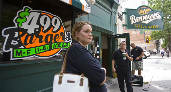
Instead, ordinary people may simply look glum, as in this photo taken when the Bennigan’s restaurant chain went out of business. Some have lost their jobs and others may have lost their lunch, but no one can see a ready alternative. The photograph itself reinforces a mildly depressive reaction: a diffused, cluttered shot with the lighting either dull in the foreground or too harshly bright in the background. No one of the three figures holds our attention, yet they don’t form a coherent group either. Arrayed along a line of sight that leads only into the open street where others go about their business, the prospects for a new start seem slim.
Other elements of the picture add more to the story. Look at the garish ad for $4.99 burgers. That probably includes fries as well, and in any case it’s a good example of how the US has been awash in cheap food. Look also at the guy’s supersized drink. Or her large bag-the fashion that summer-or the fact that no one in the picture has been going hungry. Even as the restaurant closes, it does so amidst signs of overconsumption. Add the American eagle from the sign in the upper right of the photo, and you’ve got a small allegory. An entire way of life based on cheap food, cheap gas, and constant consumption may be shutting down.
Over 50,000 factories have closed in the US in the last ten years, while each one was no more than a local news story. And how many photographs do we need of factory workers walking to their cars on the last day of work? Along the way, labor itself has become largely invisible. Such is the fantasy of pundits promoting a post-industrial, high-tech, global service economy, and one result of the continual erosion of organized labor. Business page photography is devoted to executives and machines, and the iconography of Workers Building a Nation is available only from the New York Times Store. An entire period of economic restructuring could be occurring in plain sight yet largely unseen in the public media.
Of course, filmmakers, photographers, and other artists have tried to visualize the unfolding disaster. Most obvious is the attempt to dramatize greed, as with the recent reprise of Gordon Gecko, and photographers are drawn to the protests in Europe and now in the US, as they provide visual salience. (It is telling that the coverage of the Occupy Wall Street protests have settled so often on the signage: only then can one distinguish it as a protest about political economy, while otherwise the costumes and mise-en-scène are all too familiar.) More topical conventions also emerged, such as shots of despondent stock traders, boarded up homes, and factories become eerily beautiful ruins. These and other attempts to find the representative image are all worthwhile, but they also reflect the basic problem: until the image is aesthetically significant, it can’t do the work of engaging the audience.
The problem is not that the best images are being denied or censored: it’s that they aren’t there to be taken. A $5 dollar debit card fee is never going to destroy a family, but it’s a fitting example of how profit-taking has eclipsed all other values””and it doesn’t make for a good image. So how does one capture that reality visually? With a photo of someone standing at an ATM machine? Of the Bank of America façade shot from below at a severe angle? (Yes, those have been tried, and how well did they work?) More important for our purposes, can one see how predatory corporate practices are in fact evident in many ordinary scenes, if one knows what to look for?
The key, we think, is to think seriously about banality. We do not mean the banality of evil””that’s too easy, and too limited. We mean garden variety banality, the kind that would be there anyway as part of the background: the telephone poles you don’t notice, “Tuesday noon special” in black letters on the burger pit sign, the cars parked outside the military recruiter’s office in the strip mall. Always there, but perhaps not quite the same: How many additional cars? Why is fast food being discounted? Why are the telephone lines still above ground? Reading banality requires burrowing into what is most ordinary about ordinary life, in order to see. To see what? Perhaps how people are making do, perhaps what is being lost, perhaps the structural changes reverberating throughout the society.

All public art may require a tolerance for banality, but we are suggesting something closer to appreciation. Instead of expecting the photographer to find a way to lift images out of the unrelenting ordinariness of life, the viewer can learn how to dig into cheap materials, limited options, and worn routines. A boarded up house or a deserted housing development is a sure example of the collapse, but neither one will have much drama or any other affective relay. But the house may reveal how there is a texture to decline, and the unpainted suburban development may mark a failure of public-private cooperation that is not otherwise being discussed. Just as artistic refinement is a way of seeing, of making sophisticated discriminations within and through an art form, so is banality a way of seeing, of making discriminations within and through a domain of ordinary life. And just as artistic sophistication requires an interpretive community and institutions, the banality found in public art can be a resource in respect to the political community and governing on behalf of a public interest.
When photographers make a point of presenting””and not ennobling””banality, there is good reason to pay attention. Instead of a quick search for irony and critical judgment, one might dig into the inertia of the scene, its dull resistance to aesthetic engagement. Some photographers have been doing their best to create such an audience.
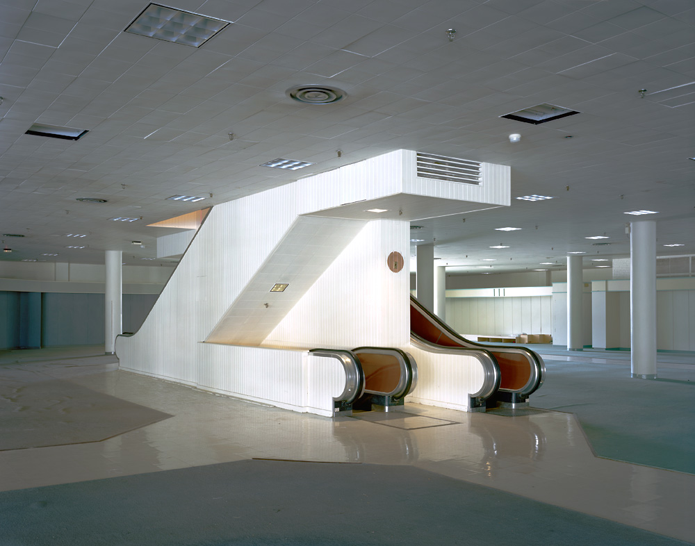
Brian Ulrich’s Dark Stores series is revealing in this regard. This photograph might seem to work against our argument, as it gestures toward the aesthetic values of high modernism. The clean lines, smooth surfaces, gleaming industrial materials, and lack of decoration cohere in the empty space to foreground pure design. For once we see the escalator as a stand-alone object, a work of industrial art, instead of merely using it unthinkingly.
Nor is this an image of a ruin: there are no stray papers blowing through the hall, no bird shit and empty bottles. It could appear in a trade magazine advertisement to sell a department store: “200,000 square feet of profits, waiting for your management.” Perhaps that’s the cue. The scene is thoroughly pedestrian after all. Instead of an artwork, we see cooling grates, electrical fixtures, cheap ceiling tiles, faux woodwork, and buy-it-by-the-mile flooring. And what is featured is precisely what is missing: the shoppers and clerks, the continuous movement up, down, and around the structure, the welter of economic activity that would make one not see the escalator precisely because it was working, because people were working.
And yet the machine still dominates the scene. Indeed, we see that an escalator is not just part of a building but a machine like a bus or an airplane. Or an economy. Like an escalator, an economy does nothing more than move things around: people, goods, labor, money, and so forth in cycles of exchange. Thus, the banality of the scene is inescapable, and yet the ordinary surface of life is what provides a basis for public deliberation. Economic activity is not to be an end in itself, but a machine for moving people as they strive for a better life. Infrastructure is important, and there need be no magic in the marketplace, just wise investment. In a society that overbuilt and overextended its credit, however, one result will be empty spaces, idle workers, and desolation. One might wonder whether the goal should be to fill up this space again, or to walk away, leaving behind a mausoleum to consumption while looking for something that works closer to home.
To conclude, understanding the recession may require a visual recession: cutting back on dramatic action shots, signature moments, and, dare we say it: iconic images. The photojournalist’s task now includes documenting dispersion, retraction, erosion, and anxiety. To do that, one might dwell on banality as a way of recognizing the world, and as a resource for artistic engagement and critical reflection. To do that, however, may require not dumbing down, but giving up a precious commodity: one’s sense of taste, or style, or you could even say: class.
Image Credits:
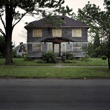
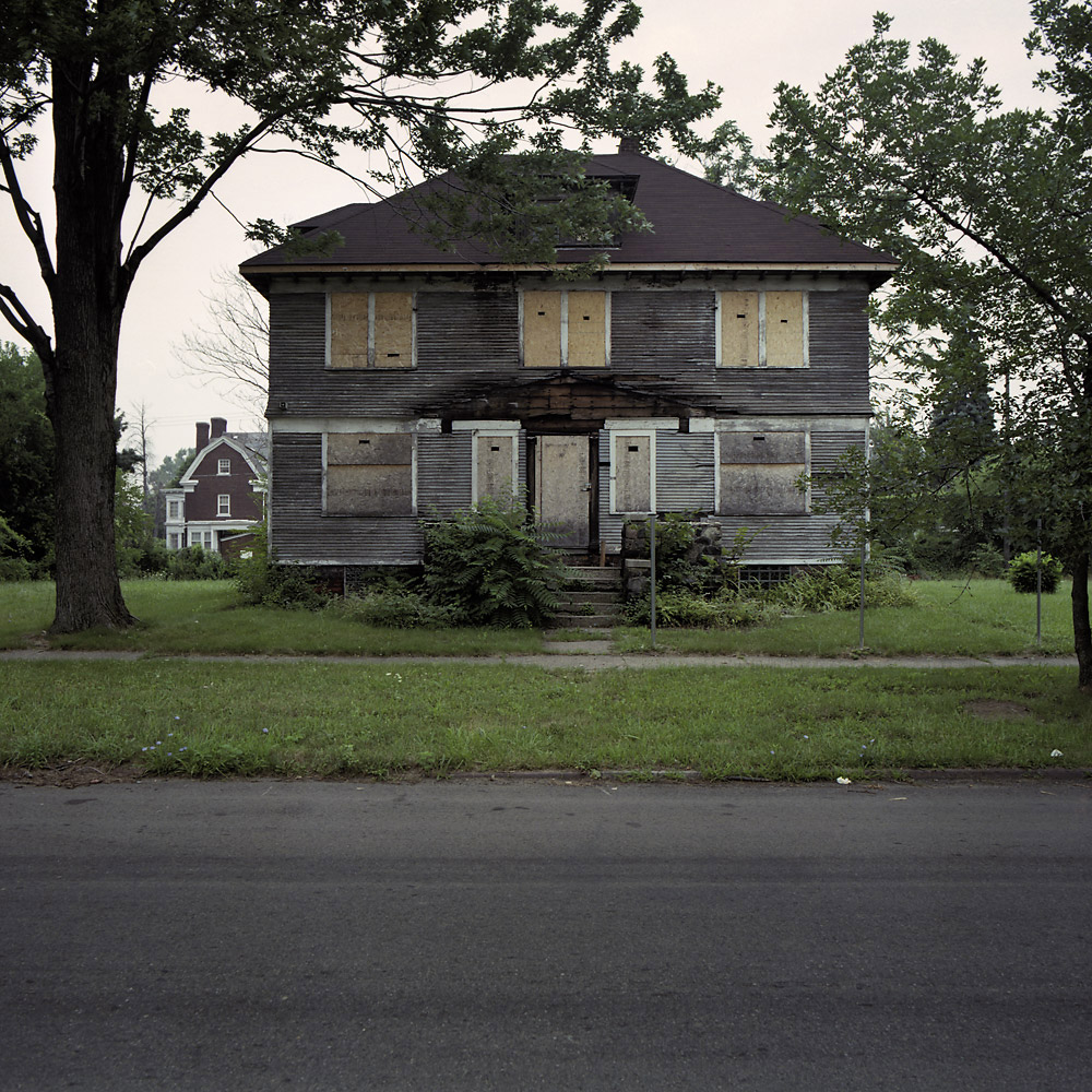
1. Abandoned house in Michigan
2. Bennigan’s restaurant closing
3. Boarded door of a foreclosed house
4. Escalator in an abandoned business
Please feel free to comment.
This is a great topic and the essay is full of interesting ideas.
However, I find it somewhat lacking in that it doesn’t go very far into analyzing photographic style and the characteristic expressive tropes. While these 4 photos do not reproduce the typical formal aspects of, say, 1930s Farm Security Administration photos, no 1 and 3 certainly fit into the common current genre of “decay porn” (Detroit is a favorite location here). No humans or animals in the frame, planimetric composition, the overt marks of temporal change–all the common marks of this style.
At the same time, it seems that in US postwar photography there is a rather strong tradition of using banality (or banal subject matter) for purposes of critical analysis: Walker Evans, Robert Frank, Lee Friedlander, Joel Meyerowitz come to mind in a self-consciously formally rigorous vein. And Bill Owens in a much less formal direction: is that what you’re asking for, less sophisticated style?
The Bennigan’s shot strikes me as a failed Meyerowitz (and unlike his work, desperately needing its caption). Can we represent banality without formal style? Is that (like academic wardrobe style) also commonly a matter of generations and placement in the hierarchy? (Nothing too extreme in the Dean’s office, right?)
Chuck Kleinhans
This is a fascinating project. As I believe was the intent, it sparked more questions for me than it answered. In what ways does banality resist established photojournalistic form? What does that say about the political landscape? When the banality of everyday life resists representation (as I believe it does), what are the many entertainment televisual representations (e.g. sitcoms, reality TV) of everyday life and of the current economic climate really representing? What is banality in entertainment programming and how does that differ from photojournalistic portrayals? I’d like to hear a lot more about the differences between the representation of banality during the Great Depression and now, and what that means for how the nation is currently imagining itself.
Thanks. You really got me thinking.
Shana Heinricy
I’ve been in grad school too long, but I couldn’t help thinking that this article takes for granted the definition of “banality,” which seems no small point, especially apropos your willingness to recognize that academic critique is always constrained by its location and origins in a series of highly codified subcultures. By which I mean, that which you and I see as banal…
For example, the article refers to the painted color on the window of the Bennigan’s as “garish,” but I’d be willing to bet that the marketers who chose that color scheme would think of those colors in more positive terms, even if we academics still insisted that those terms were only corporate euphemisms for “garish.”
What would it mean to bridge that difference? Should we pursue a consensus to see those colors as “garish,” rather than as “vibrant,” “optimistic,” or just plain “colorful,” in which case the former speaks to the implied humanistic values of media scholarship and the latter represent methods for inducing purchase? Would more “tasteful” colors still induce the necessary consumer drive toward a purchase? Would they, indeed, produce a more tasteful hamburger?
Fascinating and thought-provoking piece. One of the problems in discussing banality is that the term easily crosses over as a term of reference from the object or style of representation (in particular the unnoticed background to everyday life – as you say, the telephone poles we don’t notice) to the nature of viewers’ relationship to the images themselves. Here I think you are clearly calling for a critical use of photography to draw attention to and interrogate the givenness of economic decline as an unremarkable dimension of everyday spaces and experiences: you want photographic banality “to be a way of seeing, of making discriminations within and through a domain of ordinary life”. However, banal images (as opposed to images of banality) tend to not to enable this kind of critical discrimination: they are precisely images that are themselves taken for granted, overlooked, barely registered, designed to be part of the background (like the telephone poles), generic to the point of virtual invisibility. So banality as a critical object actually requires extraordinary images, images which conform to a traditional aesthetic of attentiveness, defamiliarization and unveiling: effects frequently produced precisely by the kinds of juxtapositions achieved by some of the images you present (e.g. the dramatic contrast between high modernist aesthetic and pedestrian industrial scene). This is why I don’t quite understand your call for fewer iconic images or bad images: it strikes me that want you want is to make banality iconic, for photographers to enable viewer attendance and apprehension of the banal, underlying, unnoticed structures of everyday life, and for such images to catalyze and crystalize processes of public interest and discussion.
Thanks for the great comments. I”™ll grant that the essay didn”™t go as far as we would have liked. Because we were asked to be both provocative and brief, we had to simplify at several points instead of providing additional nuance, qualification, or development. Even with world enough and time, however, there would have been problems, for we will be the first to admit that we haven”™t worked out all of the implications of our argument. That”™s why discussion at forums such as this one is so important, for the work is better done collectively in any case.
The basic point across the comments is one that we assumed but failed to emphasize adequately: an aesthetic of banality is still an aesthetic””a focused exploration of a particular mode of perception””and not a simple celebration of banality itself. Likewise, “bad” images still have to be good images, just not “good” as that is typically defined by instruction manuals or editorial practices. And not only does banality require definition (for example, we tried to suggest that the term could more capacious than is usually assumed), but any definition is going to be influenced by taste and ideology (as we emphasized at the beginning and end of the essay).
Full development of banality as an aesthetic would have to take it backwards, much as Chuck Kleinhans suggests, although we are very hesitant to privilege the past as he does: one should not assume that current photographers are trying to do the same thing that Frank and others were doing””precisely because of their influence””or that current work is likely to be a “failed” knockoff of past exemplars. We definitely were not claiming that this aesthetic is new, only that it is needed (again). Likewise, as Shana Heinricy suggests, we think that much could be gained from fine-grained comparisons of recession photography today with FSA documentary work in the great depression, and with other work as well. Banality probably goes only so far in accounting for documentary photography in any era, and where it does apply, significant differences are likely to remain; our point was that in moving too quickly to celebrate the photographer”™s work on other, more familiar terms, something important could be lost.
So it is that Paul Frosh puts his finger on what we think is crucial to an aesthetics of banality: “a critical use of photography to draw attention to and interrogate the givenness of economic decline as an unremarkable dimension of everyday spaces and experiences . . . and for such images to catalyze and crystalize processes of public interest and discussion.” These objectives do require the right images, images that often already are available. To be seen, however, the viewer has to be attuned to what they are doing and to what they are not doing, which in turn can expand the archive of those images that should be taken seriously. Indeed, if the analysis of everyday life goes far enough, the useful distinction between images of banality and banal images may no longer be needed. That is, it may not matter whether the photographer or the spectator does the heavy lifting, as long as the result is a stronger, more engaged sense of vision.
Like the telephone poles that are not noticed, there are all the overhead wires, such as seen in the photo series, “Live Wires” at
http://www.efn,org/~hkrieger/livewire.htm
Pingback: The Banality of Violence Robert Hariman/Northwestern University and John Louis Lucaites/Indiana University | Flow
Pingback: Digital Media: Hot or Cool? Nicole Starosielski / Miami University | Flow